
We believe design as not just an art,but a science too!
Informative articles that will help you make visual designs enriched withusability, understandability, and actionability.

Informative articles that will help you make visual designs enriched withusability, understandability, and actionability.

Moodboard serves as a tool that organizes design ideas into categories or groups that convey particular moods, emotions, or feelings.
Read More
The figure & ground refers to the tendency of a human mind to simplify the complete scene into the primary object that’s in focus and the rest of the elements that form their background.
Read More
In priciple of connectedness, the objects share a common, visible, connected path. It refers to the human tendency to perceive the connected elements to be perceived as more related to each other than the element that are not connected.
Read More
Human mind tends to follow the simplest path or sequences wherever possible, and perceives them as a part of same group.
Read More
Human mind often perceives the partially visible stimulus as a complete group or shape by filling in the blank spaces. This principle make a very good use of the positive and negative spaces.
Read More
Common region is the strongest visual clue to bind the objects in one single group. This common region principle not only creates a grouping perception but can also be helpful to attract the users attention to some important sections.
Read More
Elements that are close to each other are perceived as part of the same group, or are related to each other. Let’s learn more about the principle of proximity.
Read More
According to the Gestalt principle of similarity, the objects with similar visual properties are perceived as related to each other or belong to the same group.
Read More
Gestalt theory is one of the best usable design practices to reduce the cognitive loads and make the interfaces easy-to-scan & easy to perceive for the users.
Read More
Imagery makes the page look engaging and helps users to process the information faster. Here is how to make them best accessible.
Read More
Form is one of the most important opportunity to convert the users into customers. Here is how you can create best accessible form designs.
Read More
Accessibility means being more inclusive with your audience. Here is how you can make the typography best accessible for your users.
Read More
Accessibility means being more inclusive with your audience with different abilities and different methods of handling the technology
Read More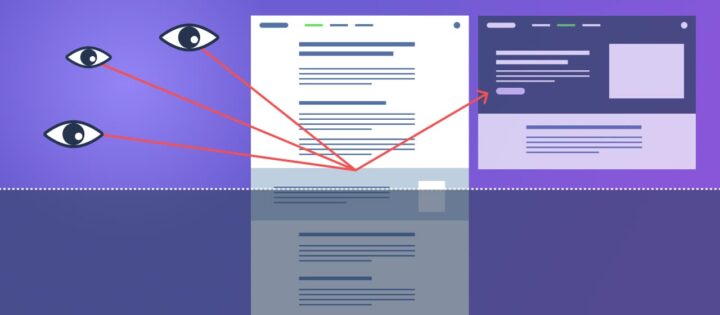
False bottom is an illusion of completeness which can be avoided by giving your users a natural reason to scroll.
Read More
Here are a few examples showing how we can improve the scannability of our page by applying some common usability principles.
Read More
I recently completed the Google UX Design Certificate Program. Here is my experience with this course as a visual designer.
Read More
A wealth of information creates poverty of attention. Here is how to make your layouts well scannable.
Read More
Seeking for over-perfection is always harmful. Over-perfection creates over-thinking and over-thinking kills your best ideas. Here is what you can do…
Read More
Is your interest matching with what you are doing? What are the trending design skillsets? Here is something best I could extract from my visual design career experience.
Read MoreDo you also have an exciting story or insight?Send it to us at info@uxvibes.in, and we'll feature it on our platform with your own information.