The Internet is the most crowded and distracting marketplace in the world. According to World Economic Forum, there are currently 1.71 billion websites available today. Every user has 100s of alternatives against each product and they don’t have that amount of time to spare on exploring one single option. If you failed to convince them about your product at any given point, they easily can switch to another.
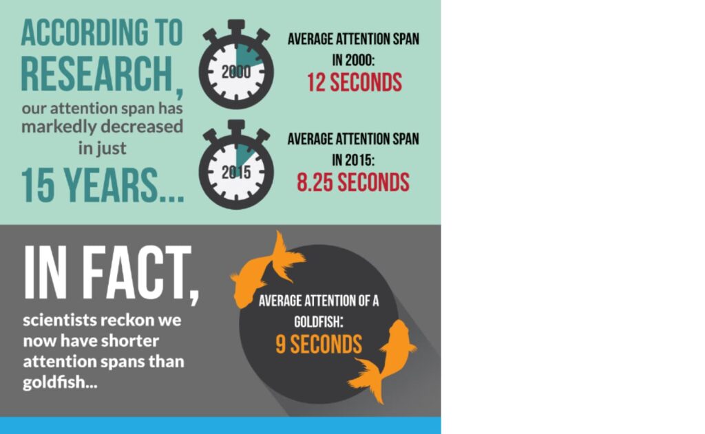
Did you know an average attention span of web page users was recorded as 12 seconds in the year 2000 which decreased to 8.25 seconds in 2015 (C/O: Supportive care ABA), and could be approximately 7 seconds in today’s date.

In simple words, every user allows you their 7 seconds to inform them about your products. Now it’s our turn to make the most productive outcomes into that for both sides i.e. users and products. Every second counts! In that case making the information processing easier for the users is of utmost importance so that they can consume more information about the product in less time. Every inefficient cognitive activity, such as grappling with interfaces, consume valuable user time that may lead users to lose the confidence about our product which could be better utilized in product knowledge.
Out of many, Gestalt theory is one of the best usable design practices to reduce the cognitive loads and make the interfaces easy-to-scan & easy-to-perceive for the users.
Gestalt theory
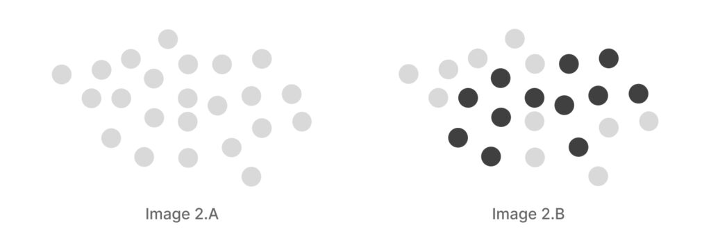
Our mind is trained to find a single, common pattern wherever we see any complex arrangement of visual elements. In the image 2.A below, although there are only many circles put together in a random manner, we would perceive them as a single group and completely disregard the fact that they are individual entities. While the image 2.B will be interpreted as two different groups when they are still circles as individuals.

Our mind tends to process the objects in a simplified form and tries to match that shape with the object that is already stored in our subconscious memory. You might have tried to find some animal or cartoon shapes in the cloud scattered randomly, it’s nothing but you are just trying to match that shape with the objects kept in your subconscious memory. This is Gestalt theory of human processing patterns and tendency to interpret things.

Gestalt theory is a human tendency to perceive the shapes in a simplified and unified form, rather than seeing them as multiple, disconnected objects.
This theory, originally formulated by German and Austrian psychologists in the early 1900s, predated the widespread use of terms like UI (User Interface) and UX (User Experience). It was initially explored within the realm of general human psychology but later gained significant relevance in the fields of usability and UX. After all, usability aims to deliver the most seamless and instinctive user experiences, doesn’t it?
These Gestalt principles offer a valuable opportunity for self-assessment of your designs from a user’s perspective. By applying these principles, you can make necessary adjustments to create more intuitive and enjoyable experiences. In fact, I would go so far as to assert that Gestalt principles serve as the bedrock of studies in usable design. Therefore, designers, it’s highly recommended that everyone becomes well-acquainted with them in the near future. In this series of articles, we’ll be discussing below principles from the Gestalt theory.
See you in the next article i.e Similarity.


