
Recap:
Accessibility is a practice of making the website or application useful for the persons with different abilities and different methods of handling the technology, in order to serve our product or technology to the largest and most diverse group of audience.
Those may include physically disabled, illiterates or semi literates, belonging to different regions or languages, with different infrastructure challenges, and novice in using the technologies. There are certain defined guidelines and best practices recommended to be followed by UXDs, VDs and developers to be inclusive with such a diverse category of users. In this accessibility series of articles, we’ll predominantly be focusing on visual design best practices.
Why typography
Content is the most important part of any website/application. Users come to the sites to read & understand the content and complete their tasks accordingly. On the other hand, reading on the screen is not as easy as reading in the real world. It is very strainful for the eyes. Do you know there are only 16% users who read the content on the website word-by-word. And what about the remaining 84%? They will just scan your page quickly and only if they found any piece of information aligned with their interest, will go for reading it. (source: How Users Read on the Web)
Although the quality of the content depends on the writers’ skills, a visual designer still plays an important role in optically arranging them for their users. So it becomes our responsibility to present the information in a comfortable and legible way. Here are a few best practices you can follow:
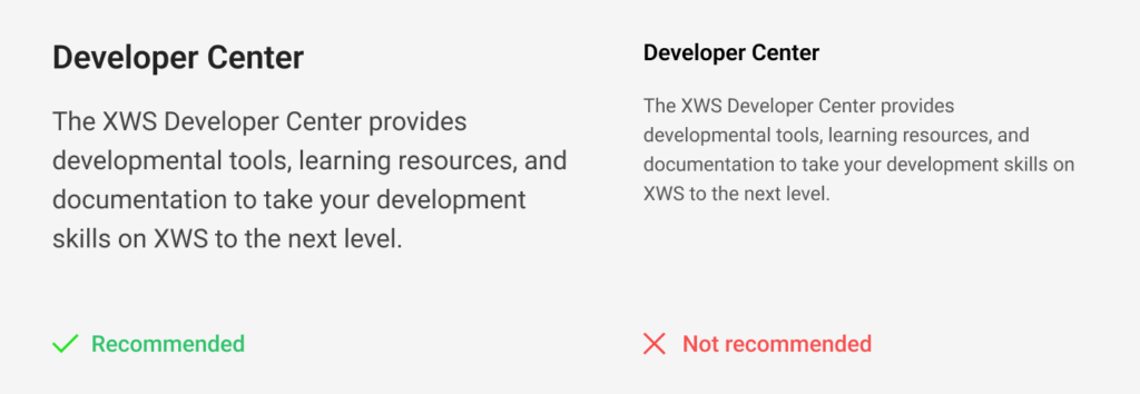
Readable typefaces
Consider the text & numbers’ legibility in a small, medium and large sizes while selecting the typefaces for your sites. If your audience belongs to the senior citizen’s category, you’ll have to be extra careful here. Although it depends upon the typeface you have selected, 16 px is the minimum recommended size here for the primary body content. Titles and tertiary information sizes will be adjusted accordingly.
Appropriate line-heights and letter-spacings
Although there is no standard figure to mention here as line-height, it is always better to start with 1.5 times with the font-sizes (eg. 24px line-height for 16px font-size) and then adjust accordingly as the font size increases. So as the letter-spaces. Smaller font-sizes need spacious letter spacings, whereas larger texts can be tightened a bit by taking the optical judgment.

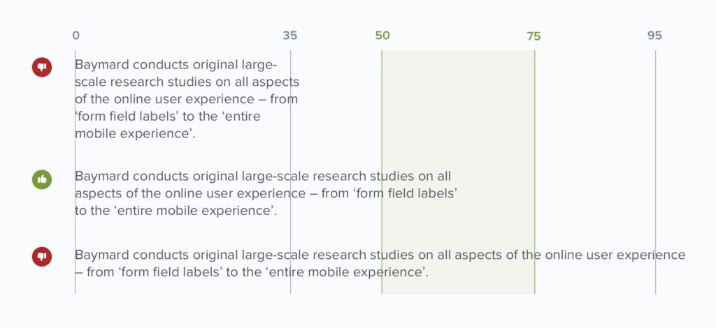
Maintain a proper line-width
Lack of an appropriate line widths can make the reading experience overwhelming for the users, Too wide text lines don’t allow users to focus on the content easily and too narrow text lines causes a lot of traveling for the eyes & fail to bring the harmony in the reading. According to the research conducted by Baymard Institute, the optimal line length for body text is 50–75 characters. (Readability: The Optimal Line Length)
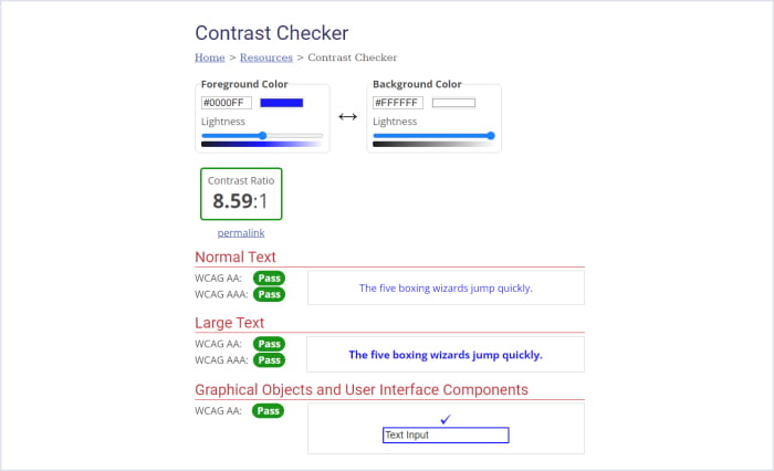
A good contrast is a key
A good contrast is a key in accessible designs. I often observe, some designers reduce the contrast that low just for the sake of stylish look that it becomes really hard to read even to me as well who do not have any eyesight issue. Some of them want to show some design elements as inactive by reducing the contrast but it ends up feeling like disabled.

Good contrast is a key in accessible designs.
Make sure to maintain minimum foreground- background contrast upto 4.5:1 for smaller texts. This ratio can go down upto 3:1 for titles and other bigger texts though. You can check these ratios through the site WebAim contrast checker. The site WebAIM contrast checker will also tell you whether your contrast is passing or failing into the defined standards.
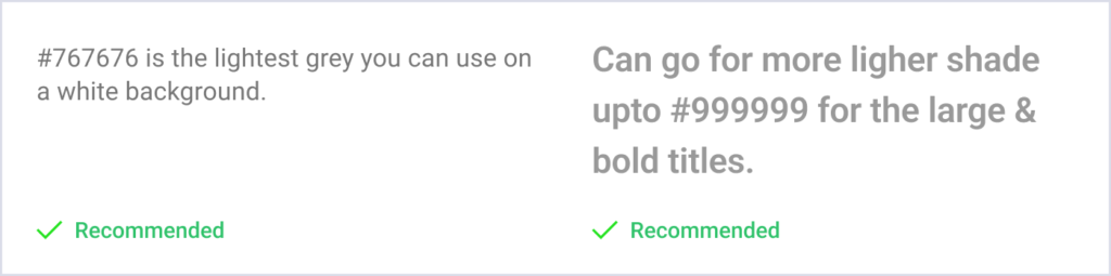
So if we go with these standards i.e. 4.5:1, the lightest grey you can use on a white BG would be #767676 for the regular body text. If the font is bold and large enough, you can stretch this gray tone to #999999 that is the ratio of 3:1. The disabled buttons or texts that are the part of imagery are exempted from these standards.
Hence next time, be ensured that you are maintaining the recommended contrast ratios in your designs. This would be helpful for the people with low vision or with some other eyesight issue, or for the users who are using the old mobile with not having a good screen resolution, or for them who are using the application in a brighter sunlight.
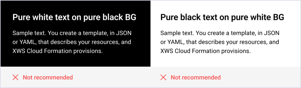
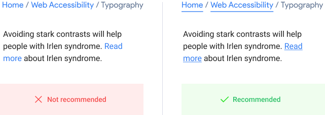
Avoid stark contrasts though.
When we we say good contrast is necessary for the well accessible designs, we should also avoid stark contrasts eg. pure white texts on pure black backgrounds and vice versa. This simple step will help people with Irlen syndrome.
Hyperlinks and highlighted texts.
Always remember in accessible designs studies, colors should not be the only visual means of conveying the information. Don’t be surprised if I say there are 300 million people in the world who are living with color blindness. Britain only has 4.5% color blind people out of their total population. (Source)
Colors should not be the only visual means of conveying the information
These color blind people are not able to recognize the entity differentiated by using colors only. Hence do not highlight the hyperlinks by only changing the colors, add some visual cues as well, like underline is the most conventional way to identify the text as hyperlink.
Visual hierarchy
Make sure you are maintaining a proper visual hierarchy in the text heavy layouts and presenting it in an easily scannable manner. Make use of effective graphics, variations in text weightages, bullet points, one theme one paragraph with describing titles like this. These small improvements would be helpful for the people with cognitive disabilities, or having some reading disorders or dyslexia. And also for the normal users who can quickly find the exact information they are looking for.
See how Google’s blog on Global accessibility have presented it in a very easily scannable manner.
- They have used an 18 px font for body copy that is a quite large size.
- See how they have maintained the visual hierarchy top to bottom, A clear, big and dark blog title which they have not used anywhere else on the page. Paragraph titles are also clearly visible.
- Content has been broken down into smaller paragraphs. Every paragraph has a different theme, you can start reading from anywhere in between. Paragraphs, subsections and main sections can be easily distinguished.
- They are using only 1/3rd of the screen width to showcase their content and have kept a lot of breathing space around.
- See how efficiently they are using bullet points, graphics and taking precautions so that users will not lose their interest anywhere.
- Every hyperlink is highlighted with underlines and not the color only.
This blog talks about the accessibility principles only, hence Google has applied all of their research and findings in designing this page. So we can definitely take it as a reference of typography and try to follow as much as possible in our designs.
So these were some typography best practices. Making these small improvements would be helpful for the people in diverse categories and with different challenges. And not only for the people with disabilities, but will be useful for the normal users as well.
In the next article of the series, we’ll talk about forms.


