
Recap:
Accessibility is a practice of making the website or application useful for the people with different abilities and different methods of handling the technology, in order to serve our product or technology to the largest and most diverse group of audience.
Those may include physically disabled, illiterates or semi literates, belonging to different regions or languages, with different infrastructure challenges, and novice in using the technologies. There are certain defined guidelines and best practices recommended to be followed by UXs, VDs and developers to be inclusive with such a diverse category of users. In this accessibility series of articles, we’ll predominantly be focusing on visual design best practices.
In our last article, we learnt about accessible typography. We’ll now learn about designing the form elements to make it best accessible.
Forms
Form is one of the most important components in conversion metrics and an opportunity to convert the users into customers. Usually, people are not very open to sharing their personal details with anyone, and when it comes to the monetary transactions, they are especially extra cautious and hesitant to fill up the financial details. In that case, even a small error in the form can make them cancel their decision. Here are some of the best visual design practices to follow.
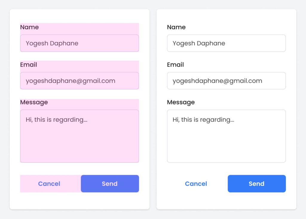
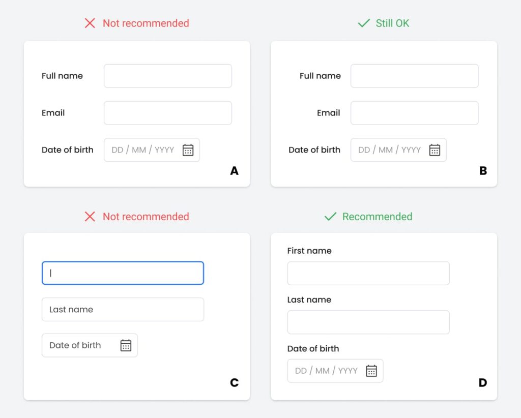
Adjust the spacings within the fields to maintain the optical grouping. It helps users to reduce their conscious memory-load to understand the form easily.
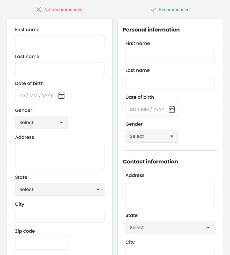
Break down the longer forms into smaller chunks by logically grouping them together like personal information – contact info etc., this will be much easier for the users to digest and will also reduce the cognitive load.
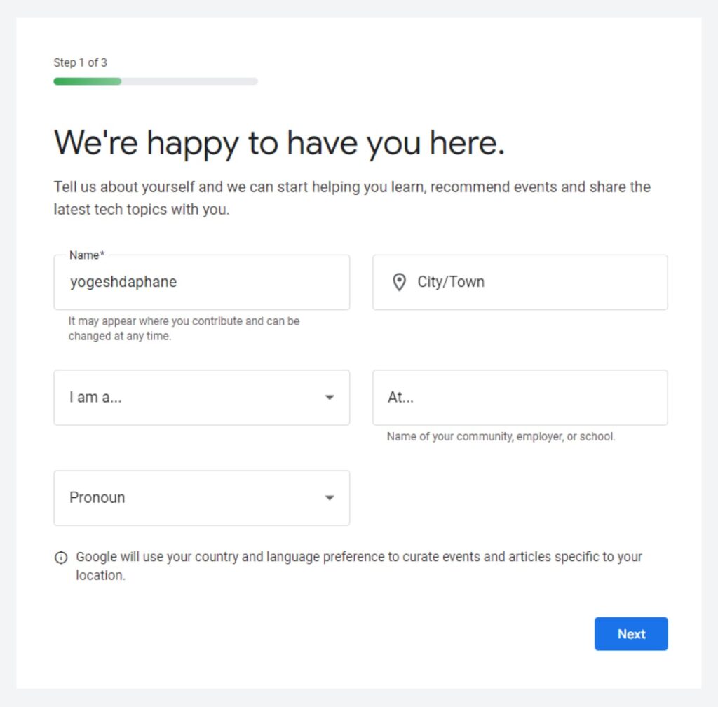
You can also use progressive steppers if the form goes too lengthy. When using multi-step forms, always display a progress bar. Progress bars encourage completion and reduce your user’s anxiety by clearly communicating how far they are from finishing it.
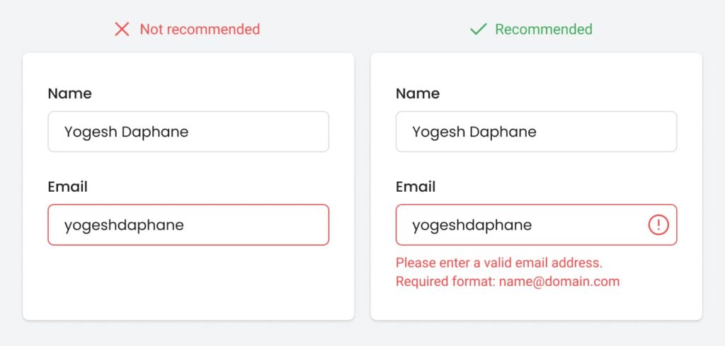
Provide more guidance to the users about the field’s exact requirement by adding the helper text or by giving examples. This would be helpful to understand what value needs to be put in a given field and how. When asking a question that users may not understand, provide clear explanations to guide them to the correct answer.
Real-time form validation is the best recommended approach wherever possible instead of letting users know about the error at the end after clicking on the CTAs.
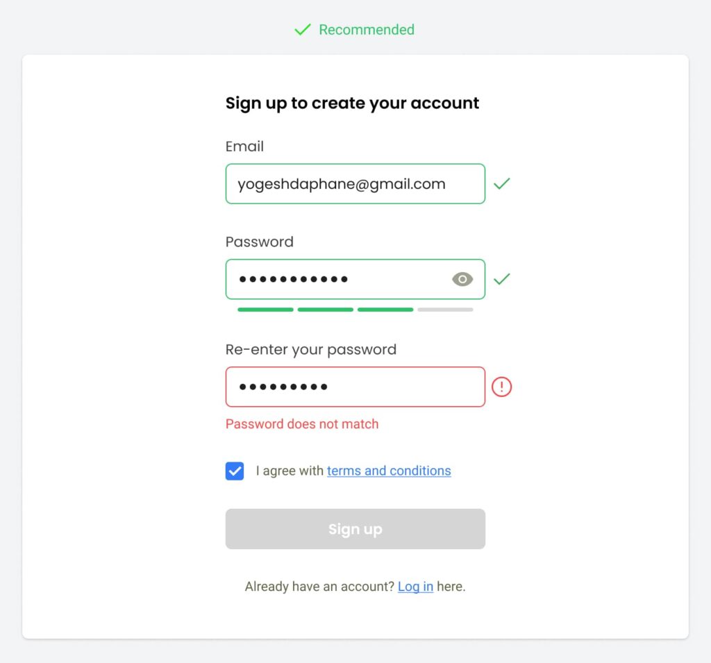
Colors should not be the only visual means of conveying the information. Do not differentiate the valid or invalid inputs by using colors only. Make use of effective icons followed by a proper explanatory helper text to display the error message. Help users to understand what was actually required to the field and what went wrong.
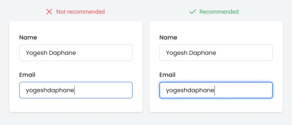
Same with the currently selected (focused) field, try some other effect to highlight the selected field instead of just showing it by changing the color like you can try thick borders, double borders, shadows etc. In accessibility studies, it is mandatory that your form or website should be completely accessible by using the keyboard without a mouse. This is helpful for the users with mobility impairments or who are handicapped by some or the other way.
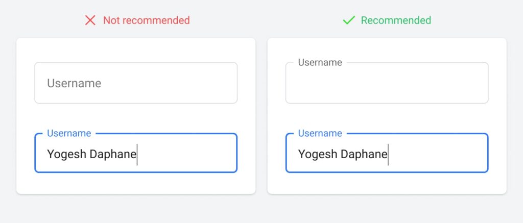
Label positions and alignments: Left-aligned labels placed at the left of the input fields impose heavy cognitive workload on users (Fig A). Right-aligned labels placed at left of the input fields are still ok (Fig B), however the top-aligned labels are considered as the most safest approach from the usability perspective (Fig D). (A study by Matteo Penzo: UX matters)
Making the use of disappearing (inline) label styling (Fig C above) is ok for the smaller forms, but the forms that require a lot of information to be collected from users- it would be good to go with all time visible labels. They are helpful for the users with short term memory issues or cognitive disorders, to verify which value they have put against which label. The all time visible labels would also help blind or partially blind users who are trying to access the form by using some screen readers.
In an attempt to shorten the length of a form or reduce visual noise, designers use placeholder text as an input label. This practice places a burden on short-term memory. The label disappears as soon as the user clicks and starts typing. And you will have to delete the entry to expose the label again. Hence, it is better to include an input label directly above the input field. The blank input field will also act as an affordance. It will help users to quickly recognize the fields that yet need to be filled with the data.
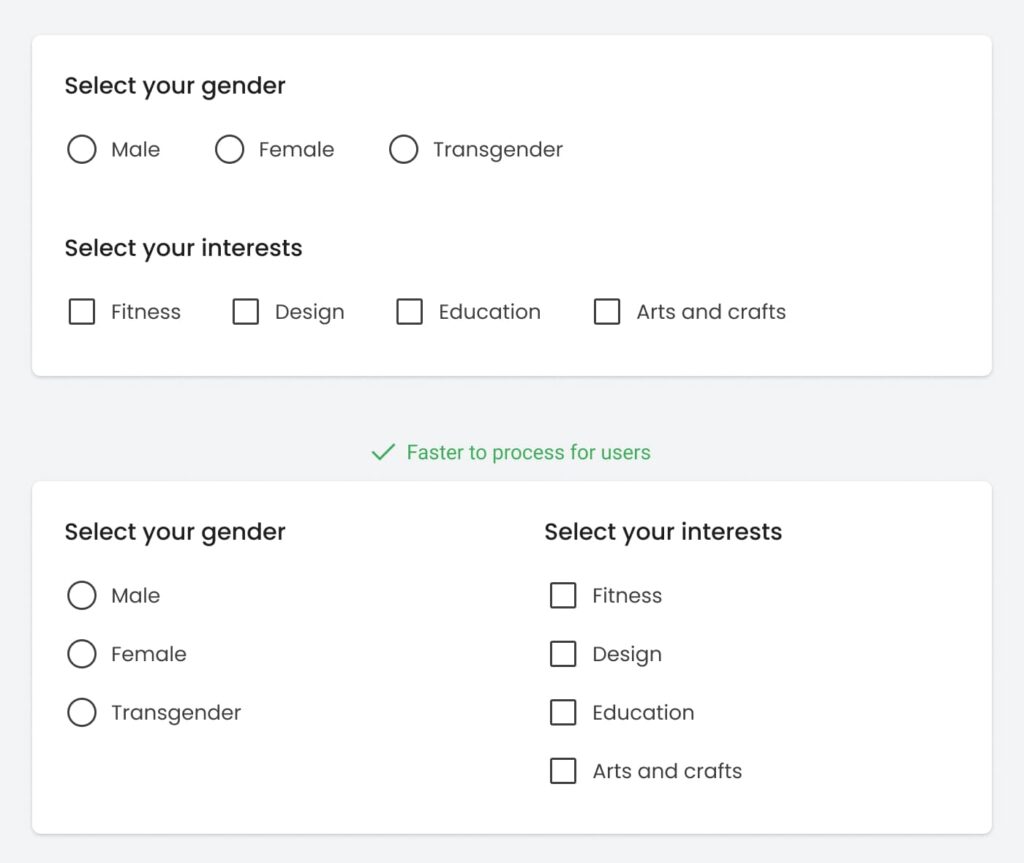
Checkboxes and radios: It has also been observed that vertically-stacking radio buttons and checkboxes makes users faster to process as compared to a horizontal layout.
Floating labels vs in-field top aligned labels: There was a trend in the market in-between period of using floating animated labels. As Google had also adopted the same for their material design system, it had kinda received an official authentication 🙂 But later, many researchers discovered the other side of the coin. Google has also now updated their animated label style to static one.
As per the research by UX movement, the animated effects can compound and trigger unpleasant reactions on motion-sensitive users. UX Movement recommends using IFTA (Infield Top-Aligned Labels) as an alternative for floating labels. Read the complete article here.
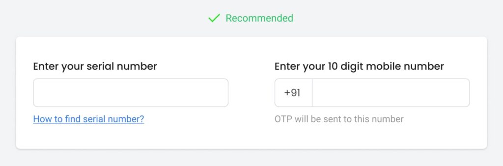
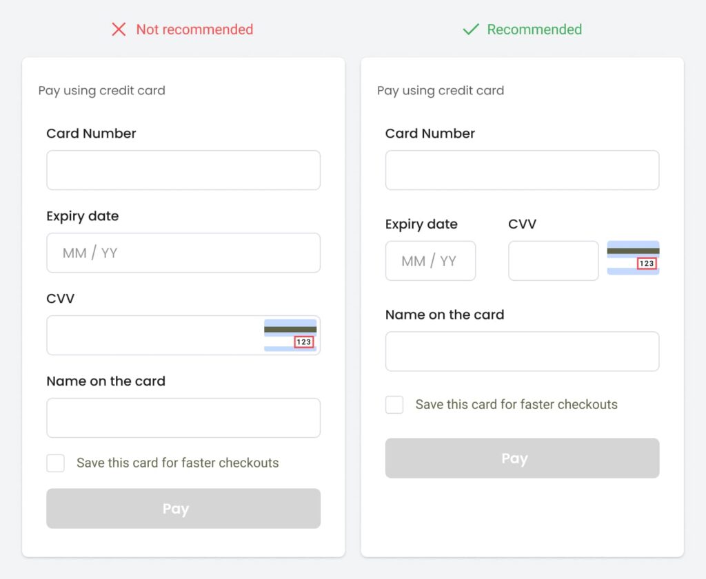
The field size should reflect the amount of text that is expected to be entered i.e pin number field should be shorter than the address line field.
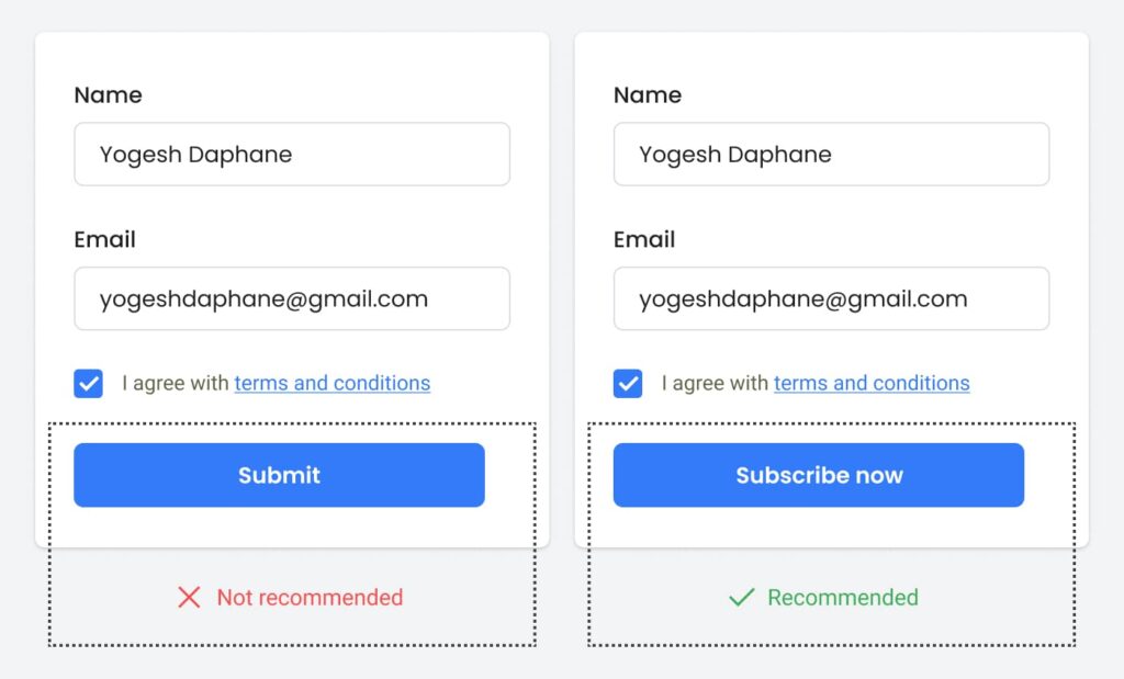
Do not use generic labels for the action buttons like Save / Submit. Let yours know what actions they are taking like ‘Subscribe now’, ‘Register for free’, ‘Create account now’ etc. These small improvements can make a big difference. After submission of the form, acknowledge the user properly. Make it clear what the user can expect to happen next.
Unbounce study shows how keywords make an outstanding impact on conversion rates. Bettingexpert.com which is a free betting community where tipsters from all over the world can share betting tips, tools, data, and much more – they just made a few tweaks in their sign-up-form-keywords and received 31.54% more signups. What did they do? In 2013, they just changed the form title from ‘Join BettingExpert’ to ‘Get FREE Betting Tips’. They also changed the CTA label from only ‘Signup’ to ‘Sign up and get the best daily tips’. These are the only edits that were caused for 31.54% more RoI! So be specific with button labels.
One more study by ‘Unbounce’ only showed that writing the labels in users’ language can help to connect with them emotionally.They just changed the CTA label in the pricing table from ‘Start your free 30 day trial’ to ‘Start my 30 day trial’ and this treatment increased their Click-through rate by 90%.
Apart from the above, here are a few things that a designer should be aware of while designing the forms.
- Try to combine the fields wherever possible for eg. for asking dates don’t use separate fields for DD-MM-YYYY, you can also use the calendar control.
- It has been observed that assuring users that ‘their data is safe with us’ and displaying social proof like ‘This much number of people have registered till now’ can make a big difference to win users’ trust.
- Keep in mind the contrast thing which we discussed earlier.
- Minimum tappable area for mobile devices should be 48 px.
- Make the form page free from any other distractions like animations, heavy graphical elements etc.
These small improvements can definitely make your user’s journey easy and eventually result in increasing the conversion rate.


