Recap:
Accessibility is a practice of making the website or application useful for the persons with different abilities and different methods of handling the technology, in order to serve our product or technology to the largest and most diverse group of audience.
Those may include physically disabled, illiterates or semi literates, belonging to different regions or languages, with different infrastructure challenges, and novice in using the technologies. There are certain defined guidelines and best practices recommended to be followed by UXs, VDs and developers to be inclusive with such a diverse category of users. In this accessibility series of articles, we’ll predominantly be focusing on visual design best practices.
In our past articles, we learnt about typography and forms. We’ll now learn about imagery best practices in accessible design studies.
Imagery
Images speak thousands of words! Images speak louder than words! Images add authenticity and credibility. Images make the page look engaging and help users to process the information faster without putting much cognitive load. Use of effective photographic imagery, charts, graphics, icons is not only helpful for the users with cognitive and learning disabilities or visual impairments, but can make the content understanding process easy for the normal users as well.
Here are some imagery best practices that one needs to be mindful of while creating visual designs.
The images you are selecting should be able to add value to the subject & personas, and not the distraction.
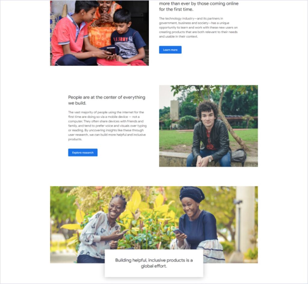
Be inclusive and thoughtful for everyone while selecting the images. Your imagery should represent a diverse group of humans like men, women, neutral, black, white, asian, disabled and others, unless your are targeting an audience with specific category / demographics. Not just from the RoI perspective, but this is a very good human gesture that brings emotional connections to our designs and products for everyone. Avoid artificial expressions or exaggerations. Let users connect with their real-life product experience.
Check this snap from https://nextbillionusers.google/ . See how Google is being mindful of their global audience.
Alternative text: Imagery can be simple (real photos, icons, graphics), complex (Graphs, infographics, diagrams) or decorative (illustrations, abstract), they all need to have alternative texts (alt text in HTML) that describe the information or function represented by them. Alt text is useful for the people with low/no vision, or for those who use assistive applications (Screen readers, speech to text, text to speech etc.) to read the content on the site. These alt text can be read aloud with the help of this technology. Although alt text is implemented by the dev, SEO, and content team together, it is good to have knowledge for designers. You can read more about alternative text at Yale University’s ‘Usability & Web Accessibility article’.
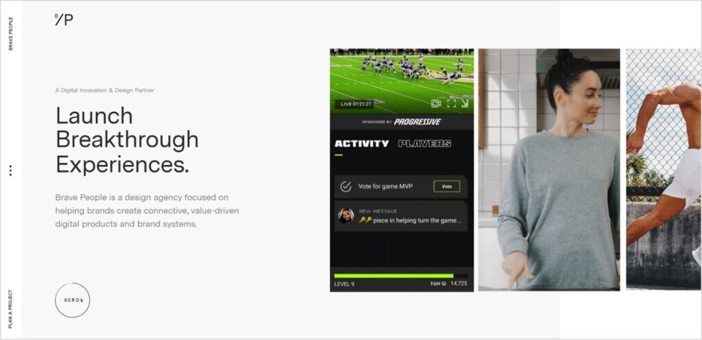
No automatic motion sliders, GIFs in loops or video players are recommended. They create distractions and prevent users from concentrating on the content. They can also trigger unpleasant emotions for the motion sensitive users like dizziness, nausea etc. In exceptional case where you need to use such sliders (eg. ecommerce site banners etc), make sure you provide all the controls to your users to manage the same like play, pause, next, previous etc.
The site https://bravepeople.co/ may look attractive at a first glance due to the motion videos, animations, fancy transitions etc., but if you notice your behavior carefully – you’ll find that you are actually not able to concentrate on the content due to these distracting elements all around.
Icons should be associated by appropriate labels. If permanently visible labels are not possible, add them to the tooltips but remember – handheld devices do not have on-hover state. Go for simple, conventional icons only and not something fancy that may challenge users to recognize. Maintain 48 px as a minimum tappable area for the functional icons.
Again, colors should not be the only visual feedback. Have you noticed the ‘Food Safety and Standards Authority of India’ has recently changed the symbol for non-vegetarian food type from a red circle to a brown triangle to help color-blind people identify it easily?
Ref: https://packaging360.in/news/why-fssai-has-changed-the-logo-for-non-vegetarian-foods/
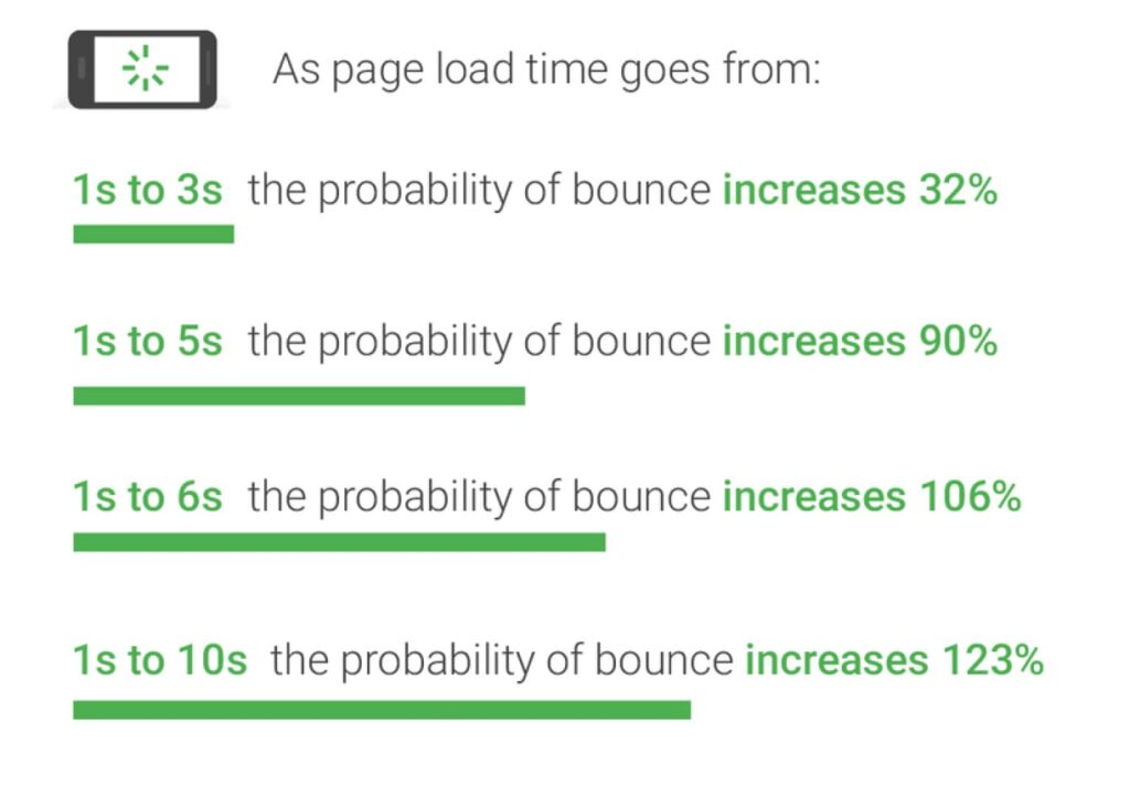
Optimize the assets correctly while exporting for development. An optimized imagery consumes less internet data and reduces the loading time. In Uganda, internet access typically costs 11 percent of the average person’s income. As a result, many people carefully monitor their data usage and avoid installing or using data-heavy applications. Try to use JPGs unless the image demands transparency. JPGs are lighter in weight than PNGs. Make sure your images are not losing their quality during the optimization. The online tool https://squoosh.app/ can help you achieve the perfect balance between the quality and weight of the image.
Try to go with SVG formats for vector graphics, illustrations, charts, diagrams etc. SVG files are usually lighter in weight compared to any raster formats. They are also good for picture quality, localizations, regionalizations, SEOs, assistive technologies etc.
Well, the visual design accessibility series ends here with this article. So far we have learnt about accessibility and its benefits, typography best practices, accessible form designs and how to make the most of the imagery. Hope this information could provide valuable insights in order to create more useful and usable designs for your customers.
See you later—ciao!