Now we understand how scannability can help users to find the information easily, while reducing the conscious memory load – here are a few examples how we can improve the scannability of our page by applying some common usability principles.
Example 1
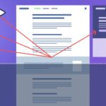
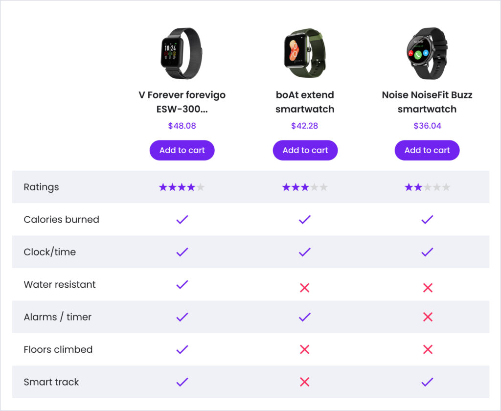
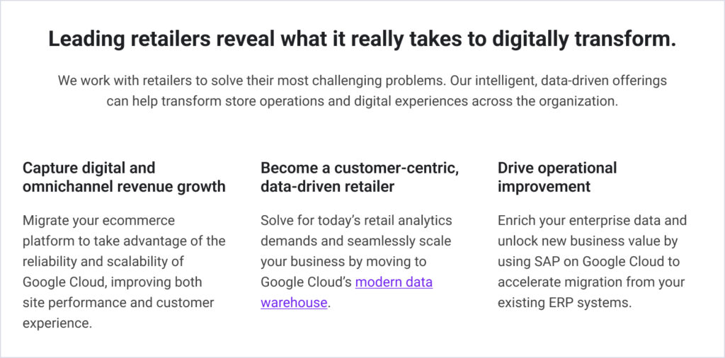
Imagine the below table as a first draft received in the form of wireframe.
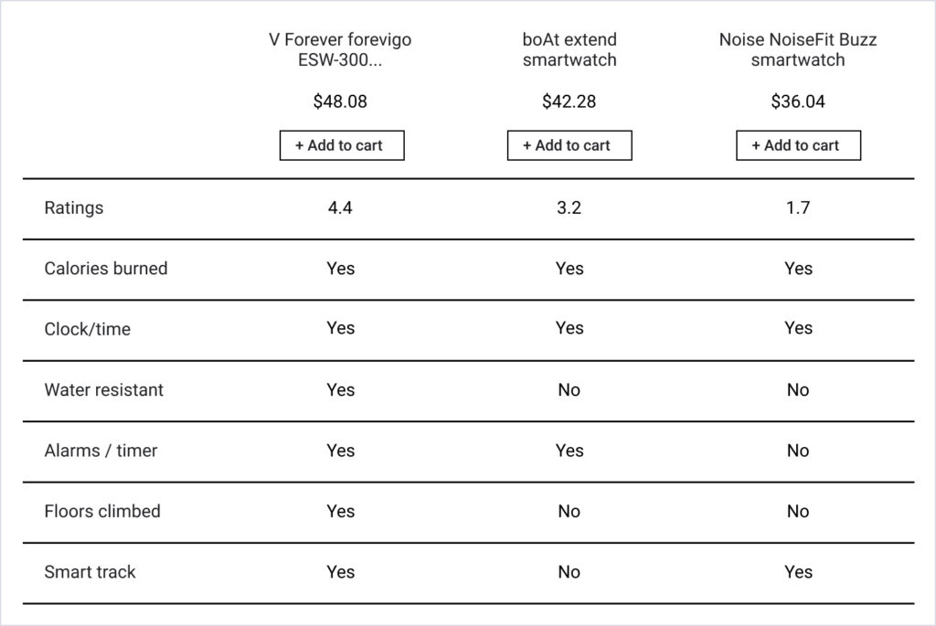
Visual hierarchy is setting up the order of priorities, which gives you the control to drive your users attention. Let’s improve the visual hierarchy by diversifying the optical weightages in order of their importance.
Brand consistency: Let’s add some branding through colors, shapes, fonts etc. 95% of purchasing decisions are subconscious, showing that purchasing is more of an emotional decision than a practical one. Read the complete branding study by By MarcomCentral.

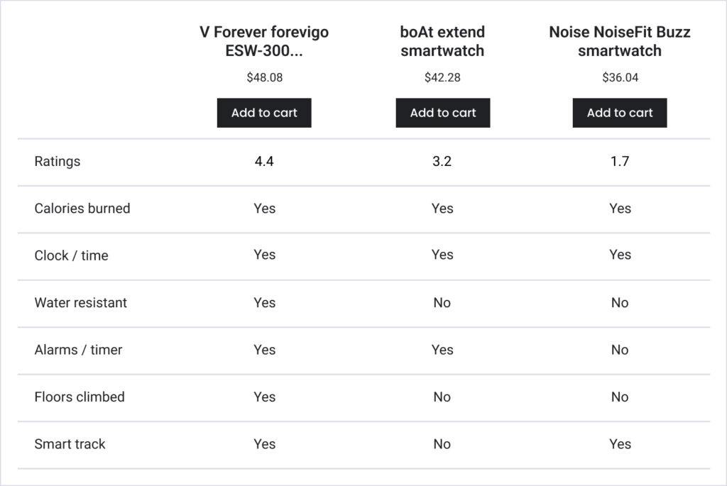
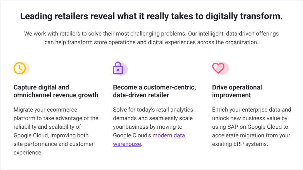
Gestalt’s law of common region: Objects within the same closed region are quickly and easily perceived as grouped together.
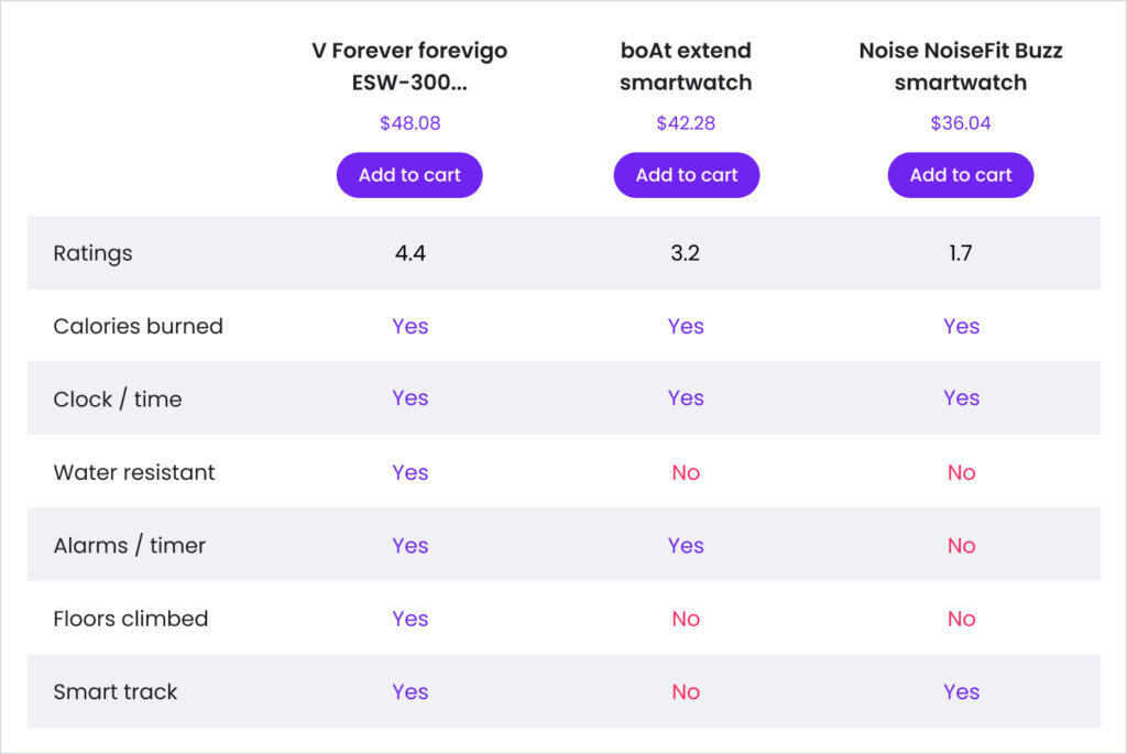
Images speak thousand words: Human brain processes visuals (images/icons etc.) 60,000 times faster than text. Imagery plays an important role in accessibility as well.
Less is more: Scannability is all about reducing the cognitive load. So let’s simplify it a bit more…
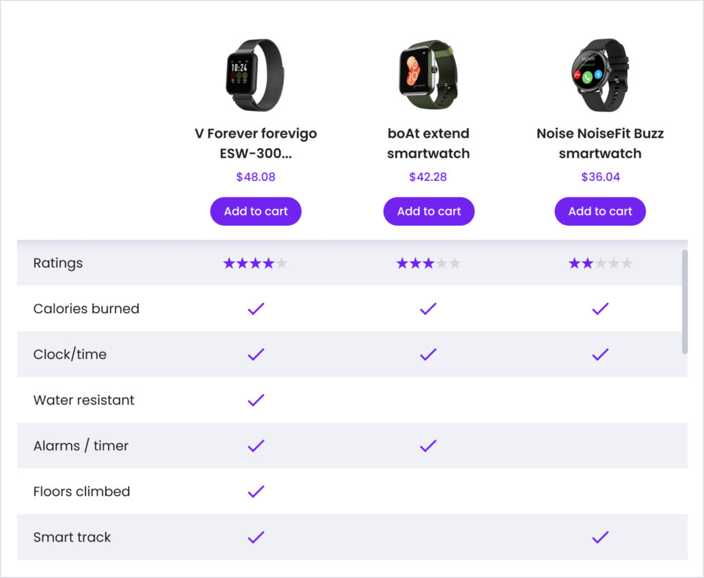
Now look at the final output above. Did you find it more scannable than the earlier versions?
Example 2
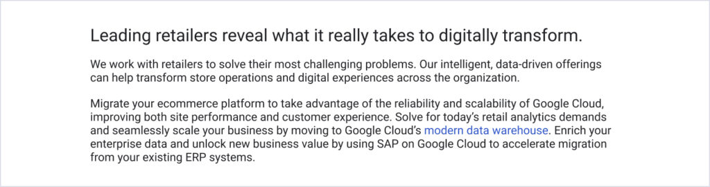
In above example, we took a comparison table to showcase the scannability best practices. Now imagine you have a text heavy content received as a requirement, will see how you can effectively arrange the typography. Assume the below raw content that need to be laid out.
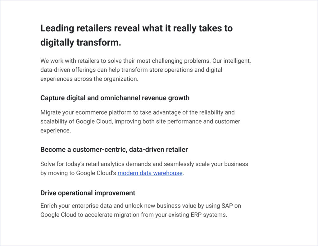
Now check the step 1 below. We have adjusted the fonts to the larger sizes. Set up the clearer visual hierarchy. Broken down the content into smaller paragraphs, while adding the gist of it as titles. Hyperlinks are clearly distinguishable and identifiable. Did it make your reading experience simpler?
Here in step 2, we have broken down the monotony of the layout.
Step 3. Some supporting icons would be a good idea! Now check back the first screen and compare. Did you observe how kept improving the scannability and ultimately the user experience?
Hope these examples would help you get better clarity in order to increase the scannability in your designs.