Moodboard serves as a tool that organizes design ideas into categories or groups that convey particular moods, emotions, or feelings.
Category: Visual design
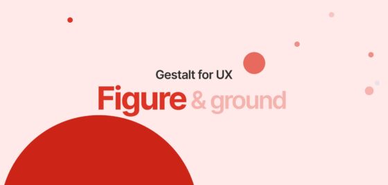
Gestalt for UX- Figure and ground
The figure & ground refers to the tendency of a human mind to simplify the complete scene into the primary object that’s in focus and the rest of the elements that form their background.
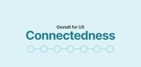
Gestalt for UX- Connectedness
In priciple of connectedness, the objects share a common, visible, connected path. It refers to the human tendency to perceive the connected elements to be perceived as more related to each other than the element that are not connected.
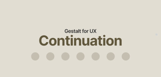
Gestalt for UX- Continuation
Human mind tends to follow the simplest path or sequences wherever possible, and perceives them as a part of same group.
Gestalt for UX- Closure
Human mind often perceives the partially visible stimulus as a complete group or shape by filling in the blank spaces. This principle make a very good use of the positive and negative spaces.
Gestalt for UX- Common region
Common region is the strongest visual clue to bind the objects in one single group. This common region principle not only creates a grouping perception but can also be helpful to attract the users attention to some important sections.
Gestalt for UX- Proximity
Elements that are close to each other are perceived as part of the same group, or are related to each other. Let’s learn more about the principle of proximity.
Gestalt for UX- Similarity
According to the Gestalt principle of similarity, the objects with similar visual properties are perceived as related to each other or belong to the same group.
Gestalt for UX: Let’s talk to the subconscious
Gestalt theory is one of the best usable design practices to reduce the cognitive loads and make the interfaces easy-to-scan & easy to perceive for the users.
Accessibility IV: Make the most of imagery
Imagery makes the page look engaging and helps users to process the information faster. Here is how to make them best accessible.


