Have you ever used the ‘Economic Times’ website’s mobile version? If yes, you must have noticed some ads popping out after every second-third paragraph. Everytime I come across such ads while reading any news, it makes me feel like – I have reached the end of the page when there is a lot more content available to read below that advertisement.
I am sure not only The Economic Times, but you must have experienced this illusion of completeness on many other sites. In the world of user experience design, this term is named ‘false bottom’.
False bottom is a specific point on the web page where users believe that this is the end of the page when there is a lot more content available outside the viewable area.
This term was first coined by Bruce Tognazzini in 1998 by referring to the vertical experience on the desktop sites (may be the reason it was called as false ‘bottom’). But in today’s world of tablets, mobiles, smartwatches etc the scrolling experience has not remained limited to vertically but expanded horizontally as well and hence, the term false bottom may look little out of the context. So let’s call it a false ending as of now for this article’s purpose.
Scrolling is now like a second nature, is it still really a considerable issue?
This is the obvious question which came into my mind as well. It is so common that my 3 year old daughter also starts scrolling the page whenever she picks up my mobile or laptop. Then why is it yet an issue to be researched even after 24 years of its discovery? Below case study gave me an answer.
……….
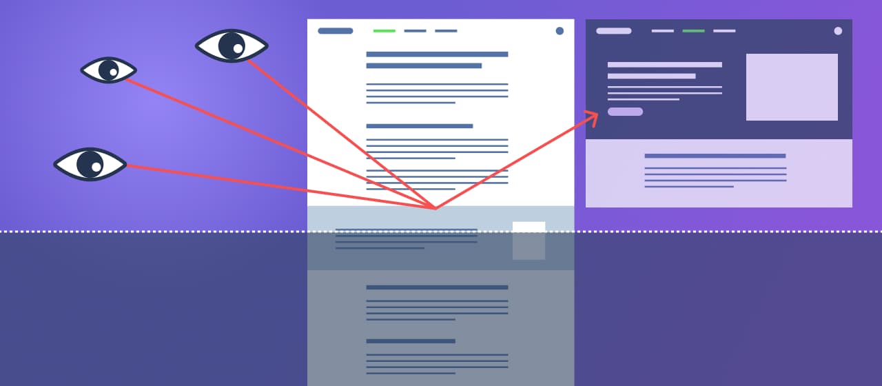
NN group conducted a usability test where users were asked to visit one site’s home page with a full image in the background, value proposition & a ‘get started’ button on it. The task given was to find out the services provided by the company.
Shockingly, 6 out of 8 users clicked on the get started button which took them to a form page. Users assumed that they would need to fill out the form first to get to know more about the company and most of them left the site half-way with the frustration.

Every brain prefers recognition over recall. Many times, users are not able to recognize the scrolling consciously even though they are familiar with the web world.
“Just because users have learned to scroll, we cannot expect them to scroll in the absence of proper visual indicators inviting them to do so. If you don’t think there is any more information laid out below, why on the earth would you scroll?”
Kim Salazar, NN Group
Common cases of False endings
False ending experience often occurs due to the lack of strong visual cue indicating there is more content waiting outside the currently viewable area. Below are some common examples.
Full page hero imagery
It is the latest design trend of having an image/ GIF/ video playing in the background covering the full viewable area of the first fold. That hero may look attractive and attention grabbing at a first glance, but be cautious! That is one of the most common cases causing an illusion of completeness. Look at the examples below.
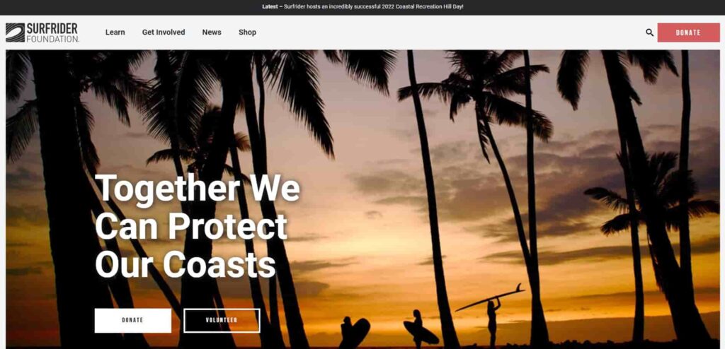

Did it take a while for you to think there is a scrolling required to view the rest of the content?
Unanticipated end-to-end separator / background
False endings can be seen not only at the first fold but anywhere on the page too. You are scrolling through a layout that uses a specific grid and suddenly a full width section/separator/background color appears! This can also be perceived as the end of the page.
See Ombia Studio’s shopping page. They have utilized full width of the screen so frequently that every time it makes you feel the end of the page. And the funny part is even if you come to the real end, you would not recognize it and will still keep trying to scroll 🙂

Too much breathing space
Use of too much white space can also make users experience the end of the page. See below the screenshot of Smartup Visuals. You’ll find this much empty space on the page at one point which can be concluded as the last module, and can be a reason for the users to move on to the next page or drop off the site.
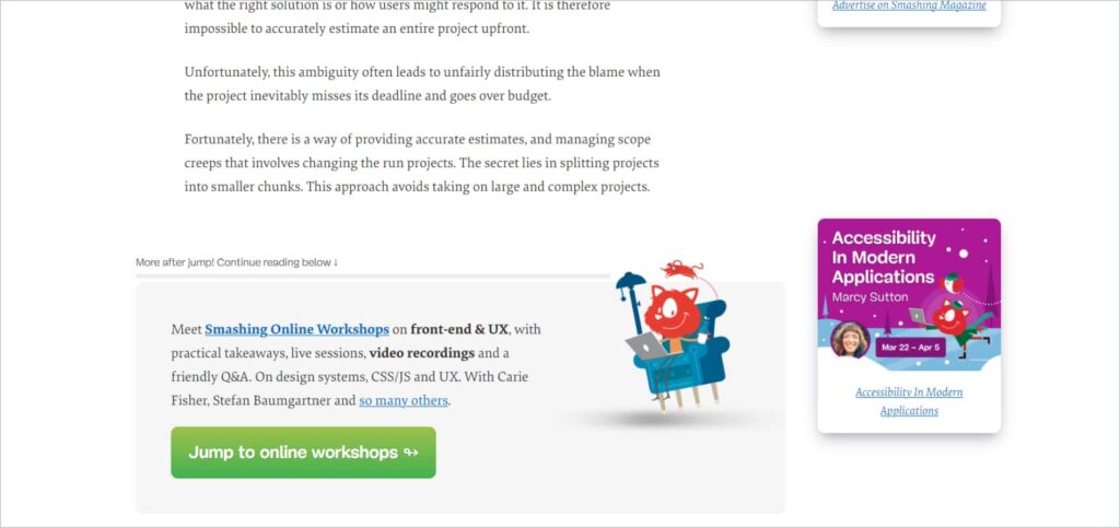
Advertisements, promotional banners
See the snap below of Smashing Magazine. The promotional banner appears when you are in the middle of the reading. Even though they have put a cue mentioning ‘there is some content available below this ad’, one still needs to put the conscious physical effort to read that line.
Unexpected scrolling & behaviors
There are certain site behavior patterns which most of the users are familiar with. Like they rarely expect horizontal scrolling on the desktops (except sliders and carousels).
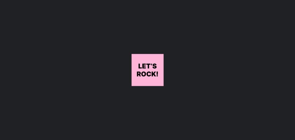
Check the website Square geeks arts. Below is the page I could first see. I tried scrolling vertically, then horizontally but nothing worked. For a moment, I thought the site was in maintenance mode but then I realized the box ‘Let’s rock’ is clickable. The trouble still didn’t end up here. The whole site has been designed with breaking the rules of universally accepted behavioral patterns which made me totally confused.
Creativity at the cost of usability is always expensive.
How to encourage scrolling
False endings occur when visual design fails to guide users about the available off-screen content, hence it’s a designers job to add the strong visual indications that would encourage users to scroll further. Following below practices can help.
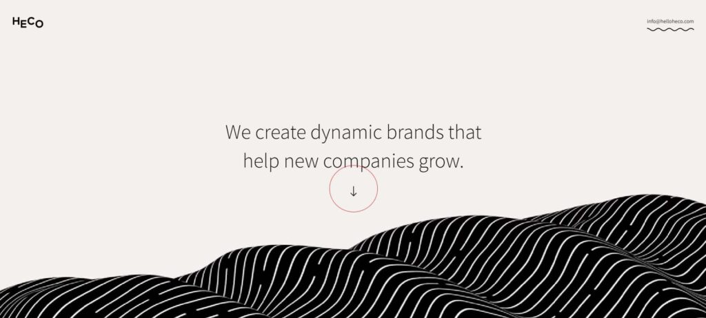
Add strong affordances (directional cues like arrows). See the first fold look of the Heco website below.
Check the whitespaces. Reduce the gaps if they are too large.
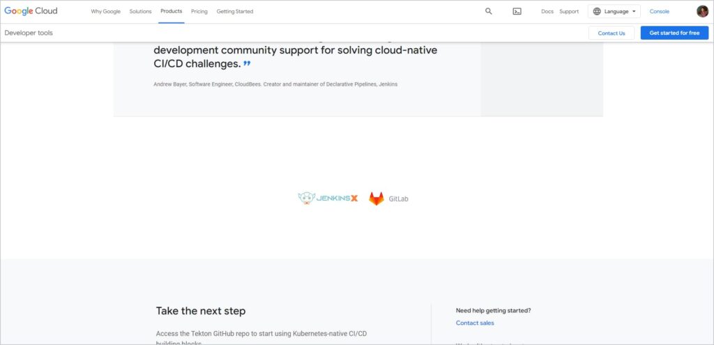
Avoid unanticipated full width separators or patches in between the layouts if you are following a certain grid throughout the page. Google Cloud uses full width modules only at the end of the pages. See below snap.
Use partially visible modules or imagery to display naturally that there is something more available after scrolling or clicking on the arrow. See how the homepage of UXvibes displays the partial part of the blogs’ module.

Avoid Putting promotional banners or advertisements at the middle of the page.
Try following globally accepted behavior patterns or prototypes. Avoid surprises to your users.
Test your layouts on various screen sizes.
Conclusion
In today’s world of fancy websites with lengthy pages, users are definitely now aware of different scrolling behaviors. But their conscious mind may not necessarily always allow them to predict the hidden content area. If it is being perceived as an end of the page, they are not going to scroll further which can end up in losing your business. But this can definitely be avoided by giving them some natural reasons to scroll.