Gestalt theory is a human tendency to perceive the shapes in a simplified and unified form, rather than seeing them as multiple, disconnected objects. It is one of the best usable design practices to reduce the cognitive loads and make the interfaces easy-to-scan & easy to perceive for the users.
In our previous articles, we already explored similarity, proximity and common region. This article now talks on ‘closure’.
Closure
Gestalt principle of closure is a tendency of the human mind to perceive the partially visible stimulus as a complete group or shape by filling in the blank spaces.
Although there are a few pieces missing in the left image below, your subconscious mind will fill in the blank (negative) spaces and accurately process the complete shape & will recognize the image easily. The IBM logo could be the another best example to understand this principle of Closure. This is an example of how positive and negative spaces are harmoniously integrated together, allowing us to effortlessly perceive its complete form without recognizing the presence of the empty spaces in between.

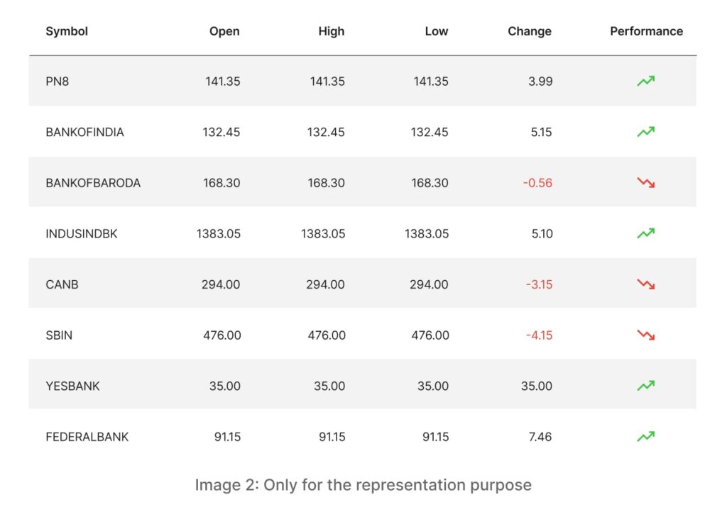
This was about the integration of the closure principle in graphical forms, now let’s try to find its relevance in UX. The table below (image 2), although we have identified it as an example of common region principle, it also serves as an exemplar of Closure principle too. Much like the IBM logo above, this table also utilizes the positive and negative space together effectively to create a seamless and cohesive user experience.

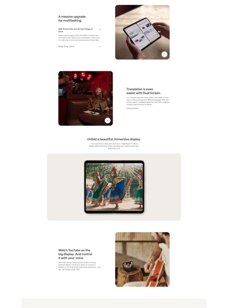
Observe the zigzag layout pattern featuring a combination of images and text on the Pixel Fold landing page, as depicted below. This particular pattern has been consistently employed throughout the page’s design. Consequently, when you engage with these images, your mind naturally associates the neighboring negative spaces as additional content boxes, facilitating a meaningful connection between them.


Apart from this zigzag pattern, there is one more module in the same page where we are getting the ‘closure’ experience. This second module in below image makes a very good use of the negative space which has naturally got created because of the two boxy modules at the top and bottom.

Explore the following example below. While the ‘Teams’ module on the Slack website illustrates a common region pattern, it’s important to note that this pattern emerges as a result of the closure experience. Additionally, this module effectively utilizes the negative space positioned between two distinct modules, one at the top and the other at the bottom. This integration of two principles showcases their complementary nature.

This checkered layout pattern is also an example of closure.

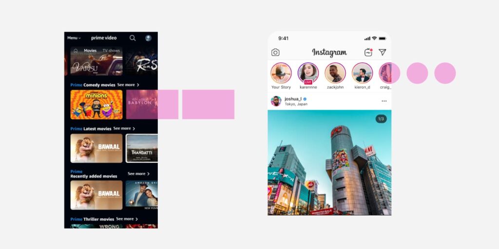
Now that we comprehend how the human mind tends to interpret incomplete shapes as the complete entities, there is one more component where we have consistently applied this closure principle. The carousel component as in the image below.

When we reveal the partial shape of any object like in the above examples, we are subtly implying that there is some additional information awaiting beyond it. You may have noticed this on Amazon, Netflix, Instagram and many ecommerce sites. They refrain from displaying the entire thumbnail unless they don’t have further information to be showcased. They are actually trying to avoid the false ending experience by leveraging the Gestalt principle of closure.
Conclusion
Gestalt principle of closure is a tendency of the human mind to perceive the partially visible stimulus as a complete group or shape by filling in the blank spaces. This principle make a very good use of the positive and negative spaces.
Our next article talks about the principle of continuation. Keep reading!


