
Gestalt theory is a human tendency to perceive the shapes in a simplified and unified form, rather than seeing them as multiple, disconnected objects. It is one of the best usable design practices to reduce the cognitive loads and make the interfaces easy-to-scan & easy to perceive for the users.
We already explored similarity and proximity in our earlier articles. This article puts some light on ‘common region’.
Common region
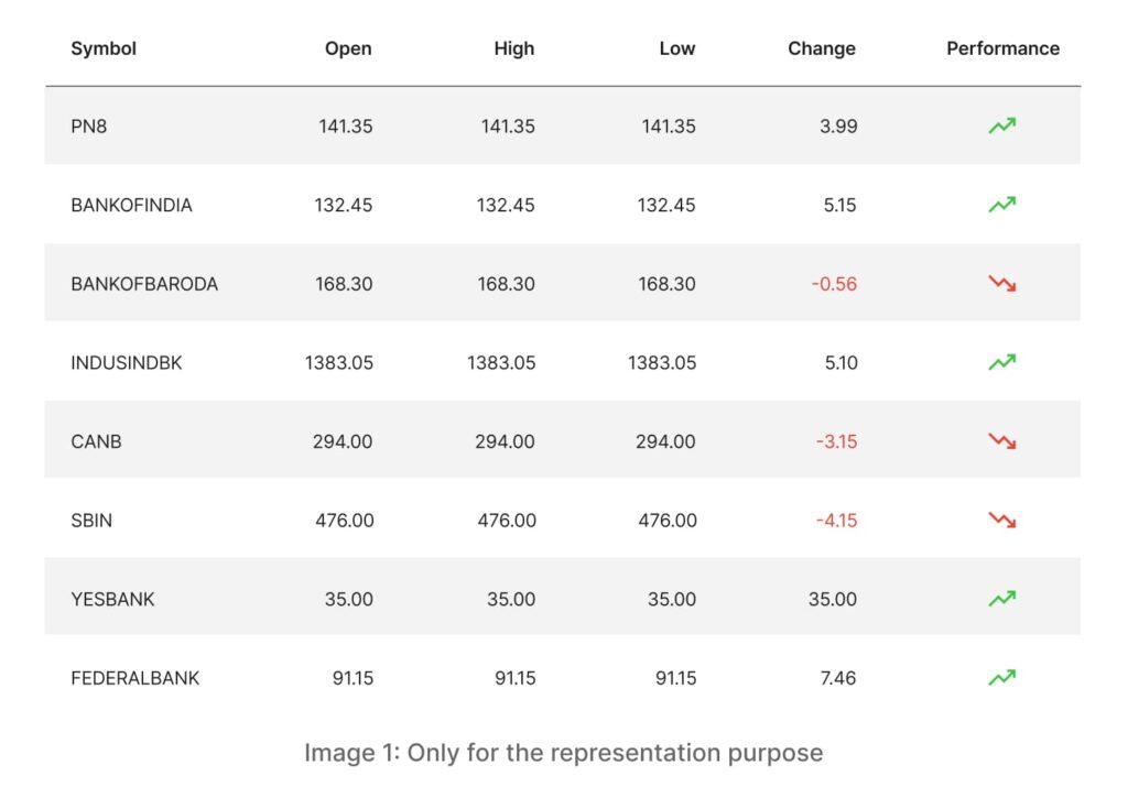
As I mentioned earlier, this principle carries the most powerful grouping characteristics than similarity and proximity. Check the table image below. Are the alternate row highlights helping us to group the rows easily? Are they helping us to perceive the groups easily? This is an example of common region principle.
According to the Gestalt principle of common region, the objects within a specific boundary are considered as a part of one group.
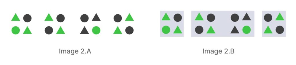
Until now, you were able to find four different groups in the Below example (image 2.A). But if I add some boxes behind a couple of groups like this, I am sure – the grouping pattern will change again and now you would see 3 groups instead of 4 (image 2.B)?
That means, this is the strongest visual clue to bind the objects in one single group. This common region principle not only creates a grouping perception but can also be helpful to attract the users attention to some important sections. You can define the intensity through the darkness or the vibrancy of the BG colors. That depends on how much attention you want that particular group needs to grab.
For example, this Slack website makes a very good use of the common region principle. They have all the modules segregated by the regions – even though this module with a white background is also a kind of a common region. They are actually setting up the priorities through the background colors. The first and the last section are the most important sections in their visual hierarchy, that’s why they are grabbing most of our attention quickly.
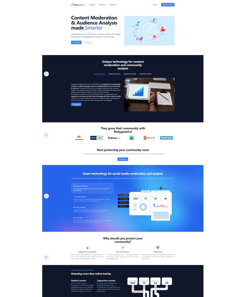
On the other hand, Bodyguard.ai is using the principle of common region to develop a robust optical segregation of the groups. They have every alternate row highlighted with dark backgrounds and reversed content, and maintained a strong contrast throughout the modules.
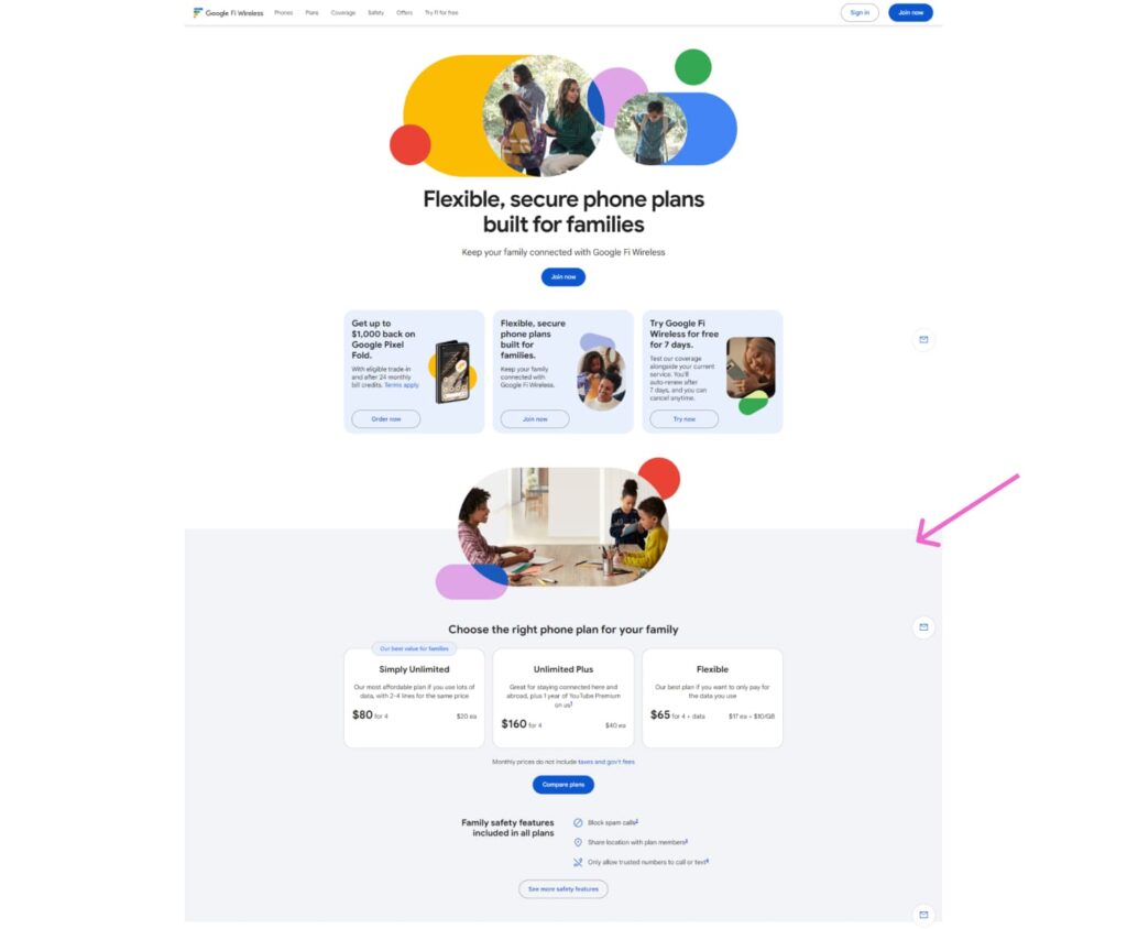
This module in https://fi.google.com/about has a lot of complex types of information to be showcased for the users which needs to be woven together effectively and that too under one umbrella. That’s why they have made use of the strongest visual clue that is the common region.
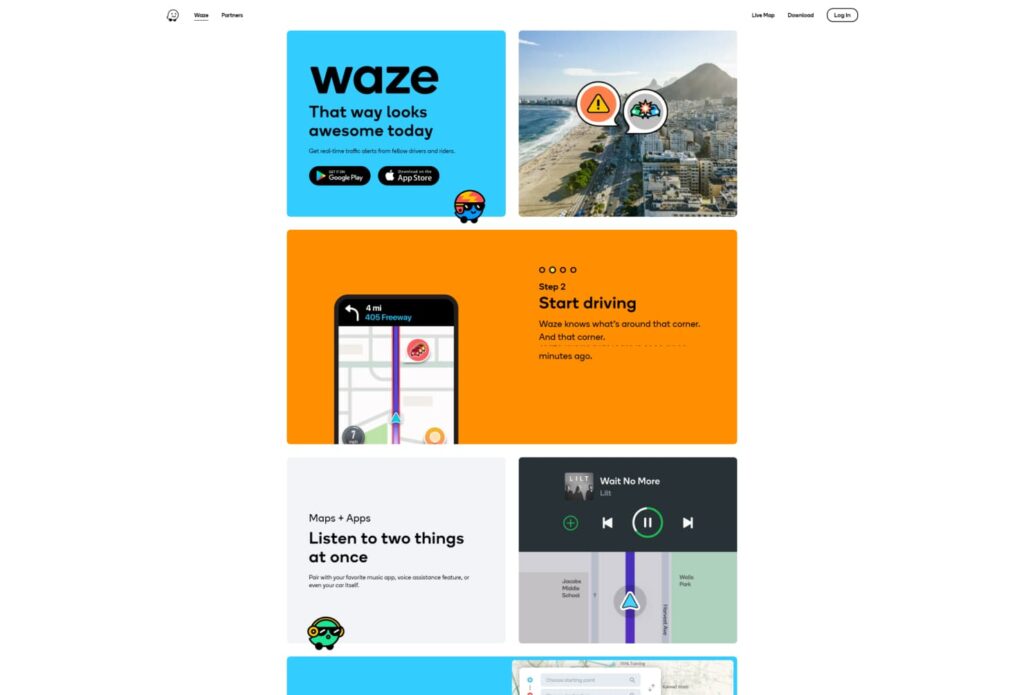
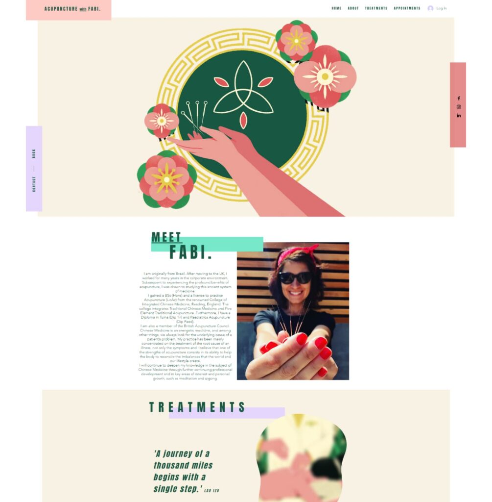
Waze.com is another interesting example. They have used bounding boxes for all the modules. Although it is looking attractive here, it is still not a good idea to use this for all the modules for the simple pages, where it’s really not required. Giving importance to everything is like giving importance to nothing, isn’t it? Just like this https://www.fabiacupuncture.com/ . The overuse of common region principle is actually making this layout more cluttered and distracting.
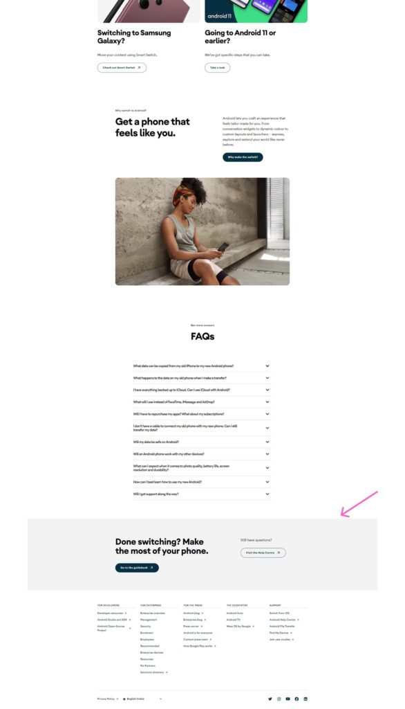
In this Switch to Android page, this guidebook module is a kind of additional, supplementary information with the rest of the page content. That’s why it has been highlighted in a very subtle way although they have used the common region principle there.
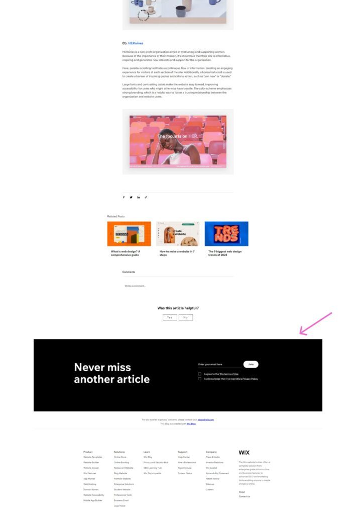
On the other hand, this newsletter module in the wix blogging site does not have any relevance with this page content but it’s a generic module applicable for the whole site. That’s why it stands out as a different section altogether.
Did you observe one thing in above example, this common region principle is also fulfilling the condition of the principle of similarity ie. The object with different visual properties than the rest of the elements is considered as ‘not a part of that group or a part of a separate group’. This is exactly what they wanted to achieve here.
These three principles are interconnected, working in harmony with each other. They complement one another, akin to three foundational pillars that not only maintain the equilibrium of your layouts but also establish the visual direction, thereby enhancing the page’s scannability.
See how ‘Shopify’ is presenting the balance of these three principles and has achieved an effective visual hierarchy everywhere.

Conclusion
Common region is the strongest visual clue to bind the objects in one single group. This common region principle not only creates a grouping perception but can also be helpful to attract the users attention to some important sections.
In our next article, we will see the principle of closure. Ciao!