Gestalt theory is a human tendency to perceive the shapes in a simplified and unified form, rather than seeing them as multiple, disconnected objects. It is one of the best usable design practices to reduce the cognitive loads and make the interfaces easy-to-scan & easy-to-perceive for the users.
Let’s try to understand the principle of continuation in this article.
Continuation
Our mind primarily operates on the emotional ground rather than rational. As a result, it often gravitates towards the simplest path whether it be straight or curved, regardless of whether it’s visually apparent. This whole Gestalt theory is based upon the innate human inclination to perceive the most unified and straightforward representation within a complex arrangement of visual elements. Continuation is another principle from the gestalt theory based on the same tendency of our mind.
According to the principle of continuation, the objects that follow the common visual path or sequences are perceived in relation to each other or a part of the same group.
Again, these Amazon, Netflix, Instagram provide excellent illustrations for comprehending the principle of continuation. These platforms arrange the sequences of thumbnails so thoughtfully that it enables our eyes to effortlessly trace a specific path, fostering the perception that they are the part of a cohesive group.

These list components below are also examples of continuation. All the list items are sharing a common visual path either vertical or horizontal.

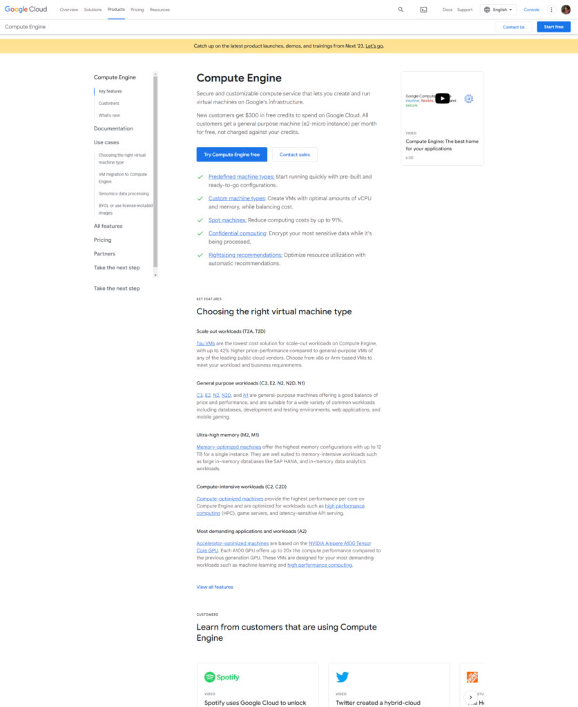
Check this Google Cloud page below and you’ll find this principle applied everywhere, in fact the complete structure of this page follows the principle of continuation as everything is aligned to the left and sharing a common visual path. The only thing is that path is not visible to us.
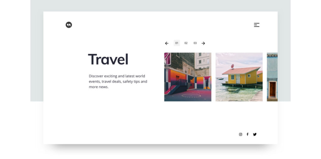
This pagination above the slider can also be an example of continuation pattern.
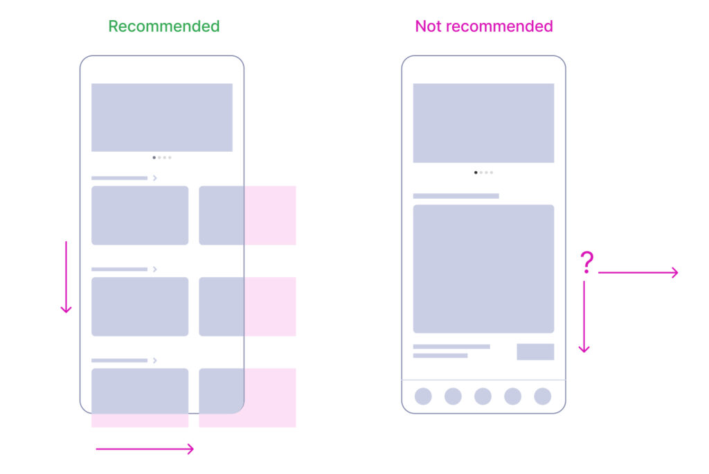
This ecommerce site structure also adheres to the continuation pattern, the only condition here is that- it should be coupled with a closure experience. Without this closure element, it may become challenging to recognize them as a discernible path or a series. Again, a false ending experience!
Now all the elements we have examined so far have featured multiple objects arranged in a series. But is it possible for a single object to convey the perception of the series? The answer is yes. Our visual perception doesn’t always require the entire series visible at once; they can also follow a designated path guided by a pointing gesture. Check the testimonial module below as an example. How do you discern that it represents the series of multiple testimonials? You are correct! The presence of pointing arrows are effectively guiding users as they are the part of larger series.

To illustrate this concept in real life scenarios, we often unconsciously apply this principle of continuation in our daily life experiences. When someone points their finger towards an object, our eyes instinctively follow the indicated direction tracing the guided path. This is precisely why we prefer the human imagery in our layouts facing inwards rather than leading to outside. The following examples provide a visual demonstration of how imagery can play a crucial role in achieving the continuation effect in our layouts, directing users’ attention to important sections.

Conclusion
According to the principle of continuation, human mind tends to follow the simplest path or sequences wherever possible and perceives them as are related to each other. This can also be used to grab user attention to some important sections.
Well, that wraps up our discussion on continuation. Our next principle shares some similarities with continuation. The key distinction lies in the visibility of direct connections between the objects. This is precisely why it’s known as “connectedness.”

