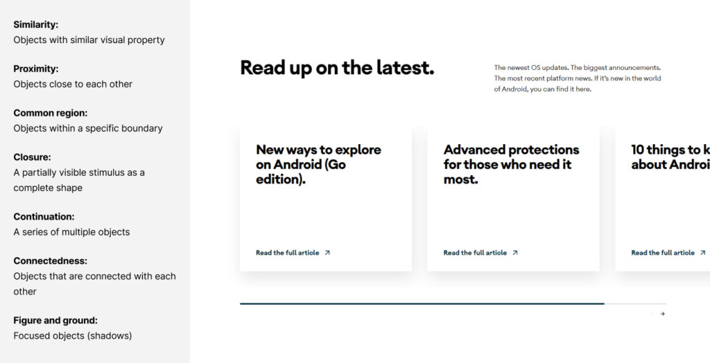
Gestalt theory is a human tendency to perceive the shapes in a simplified and unified form, rather than seeing them as multiple, disconnected objects. It is one of the best usable design practices to reduce the cognitive loads and make the interfaces easy-to-scan & easy-to-perceive for the users.
Our next principle is figure and ground. As the name itself implies, this principle encompasses two elements 1) The primary subject in focus, referred to as the ‘figure’ and 2) The surrounding elements that constitute the ‘background’. The portrait photographers often utilize this principle in their photography.
Figure and ground
The figure & ground refers to the tendency of a human mind to simplify the complete scene into the primary object that’s in focus and the rest of the elements that form their background.
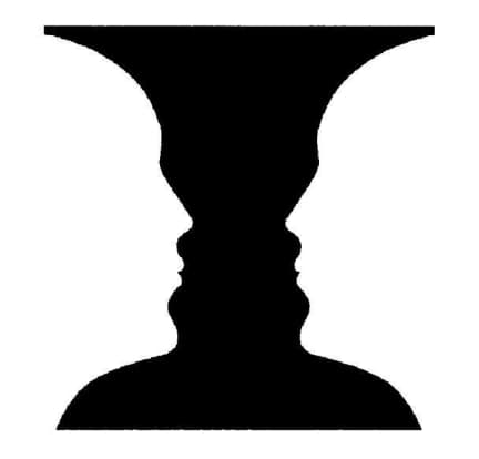
This principle is often illustrated with the ‘Rubin’s vase’ example below where you either see the vase as the focused object and two faces in the background, or two faces as the focused objects while the vase is in the background. But in UX, having such a kind of confusion is a bit risky as it may misguide our users. That’s why we use this principle a little differently in the world of usability. We have a clearly defined set of foreground and background elements so that every user would be able to perceive them in a similar manner without any confusion.
Below are a few common techniques to separate the backgrounds from the focused objects.
- By making the backgrounds blurry
- By making the backgrounds lighter or darker than the focused objects (developing the high contrast)
- By making the focused objects significantly larger than the background elements
- By isolating the primary (focused) objects from the rest of the elements
Let’s see some live examples now.
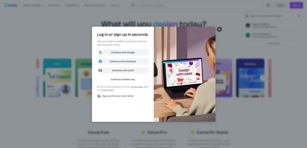
When you click on the login option on this Canva site, this is how they keep the focus on the primary content. It makes the whole background blurry while also adding some darker tint as an overlay which makes it more effective to be focused on the popup.
Next checkout the popup styling in fullcoffeeroast.com . They are not making the background blurry but the darker overlay is still helping us to remain focused on the content. It is creating an illusion that the popup is closer to us than the background elements.

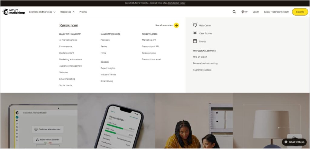
Similar thing with the gartner navigation drawer and mailchimp megamenus. The darker background overlay is creating a figure and ground experience.

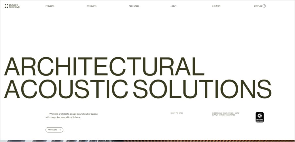
Checkout the title on this au based architectural site decor systems. The large size of the main title is creating an illusion that it is closer to us than the rest of the elements. Now is it a different part that there are some proximity issues between the two words that is making the reading experience a little challenging.
This samsung smartwatch page layout is also using the size attribute to create a figure and ground perception. The smartwatch image is looking closer to us while the description text seems to be in the background.

While Apple is creating an isolation experience to create the figure and ground perception.

Conclusion
Having covered the seven key principles in this series of articles, we have now gained a comprehensive understanding of the Gestalt theory. Although we studied them individually here, in a real world we often need to create nested grouping experiences by combining multiple principles together. As an example, the module below follows all the seven gestalt principles we discussed till now i.e. similarity, proximity, common region, closure, continuation, connectedness and figure and ground too.
If you’ve been observant, you may have already been instinctively applying these principles in your design work for years. However, I trust that these articles have shed light on the underlying human psychology, enabling you to employ these principles more effectively in your future endeavors, resulting in layouts that are even more intuitively comprehensible. When you know why to do it, you better know how to do it. Think of them as valuable techniques or concepts that can expand your design thinking, allowing you to craft more aesthetically pleasing and user-friendly layouts. For a deeper grasp of this subject, simply continue to observe gestalt patterns whenever you encounter compelling design ideas or references.
One research says, 90% of the brain processing and decision making happens in our subconscious memory and only 10% in the conscious memory (which we call as memory load). Bringing the most natural experiences to the designs means the designs that seamlessly resonate with the subconscious memory. When it comes to mastering the art of designing for the subconscious mind, gestalt principles stand as unparalleled educators.
“If you want to really reach people, if you want to communicate with them, if you want to persuade them, you need to figure out how to talk to the unconscious part of their mind.”
Susan Weinschenk (Writer of ‘100 Things Every Designer Needs to Know About People’)
With this guiding principle in mind, we draw the final curtain on this eight-article series. It is my sincere hope that this series has provided you with a comprehensive understanding of the Gestalt principles.
If you found this content valuable, don’t hesitate to share it on LinkedIn or other social networks. Furthermore, if you have any thoughts or insights you’d like to contribute, please reach out to us at info@uxvibes.in.