Gestalt theory is a human tendency to perceive the shapes in a simplified and unified form, rather than seeing them as multiple, disconnected objects. It is one of the best usable design practices to reduce the cognitive loads and make the interfaces easy-to-scan & easy to perceive for the users.
In our previous article, we already discussed the principle of similarity. Now, let’t try to understand Gestalt principle of ‘proximity’.
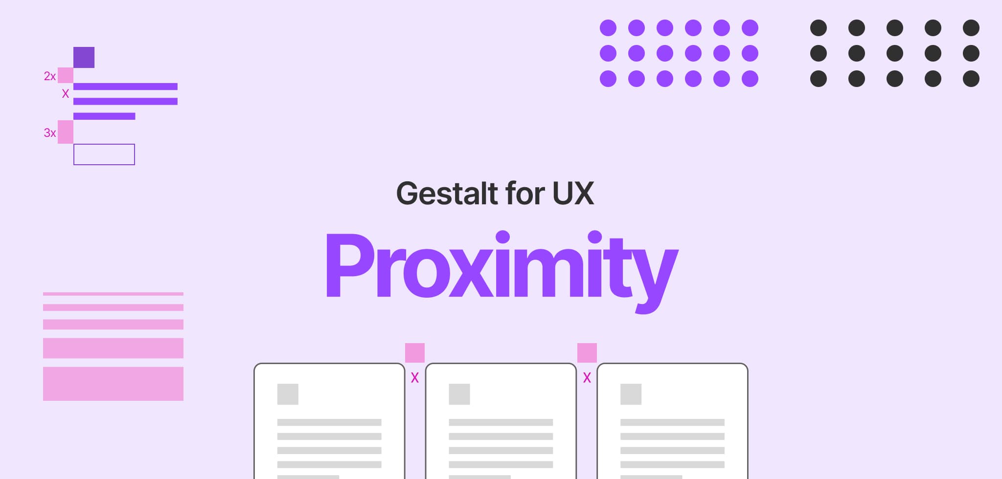
Proximity
According to the principle of proximity, elements that are close to each other are perceived as part of the same group, or are related to each other. That also means, elements that are spaced apart are perceived as not part of the same group or are parts of the different groups.
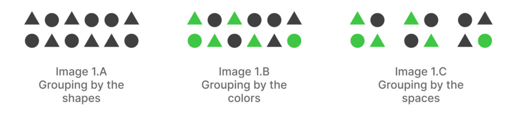
In the first state of the image 1.A, you perceived them as two different groups because of their shape attributes. In the second state (image 1.B), you still perceived them as two groups but this time by their color attributes. Now when I add some space in between some shapes i.e. image 1.C, I am sure you will be able to find three different groups instead of two although they are having inconsistent colors and shapes in each. That means spacing is the most powerful element in visual hierarchy than colors and shapes. This is proximity.
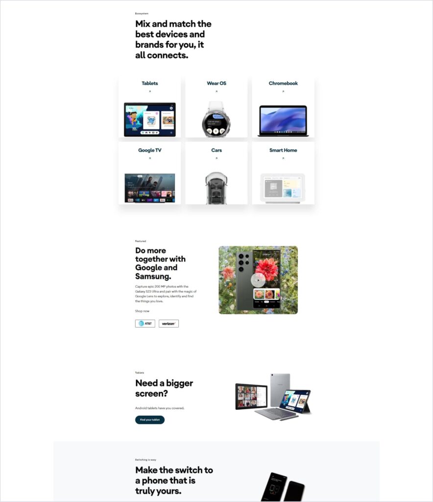
This proximity principle helps us achieve the well balanced and visually pleasing layouts while also delivering the meaningful groupings. Checkout the same android page again. They have nowhere used a separator in their layouts. But you can still find no difficulty in identifying and understanding the groupings. Did you get how smartly they have taken advantage of this principle?
Use it wisely!
Now this proximity is like a double edged sword. If applied appropriately, it will help you achieve the visual balance in your layouts and improve the scannability of the content, if not – it may also cause confusion for the users. See how airbnb has arranged all their content neatly and cleanly, using the appropriate groupings of the components. Check out how many categories they are offering in their navigation. Around 60! Did you find any confusion there in scanning them quickly?

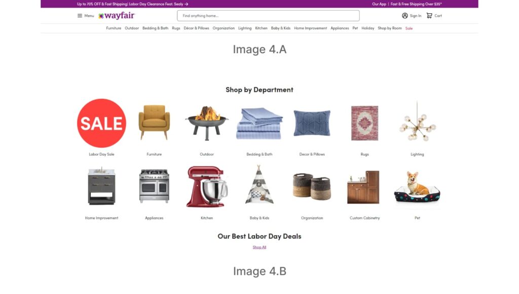
Now check out the navigation on the wayfair.com. The spacing between the menu items (image 4.A) is so short that you need to put extra effort into reading and understanding each of them. Checkout their shop by department module (image 4.B). Do you find difficulty in associating the labels with the imagery? This is how again- making the users put conscious efforts. Not only the navigation, but this whole site is the best example of overuse of the Gestalt principles.
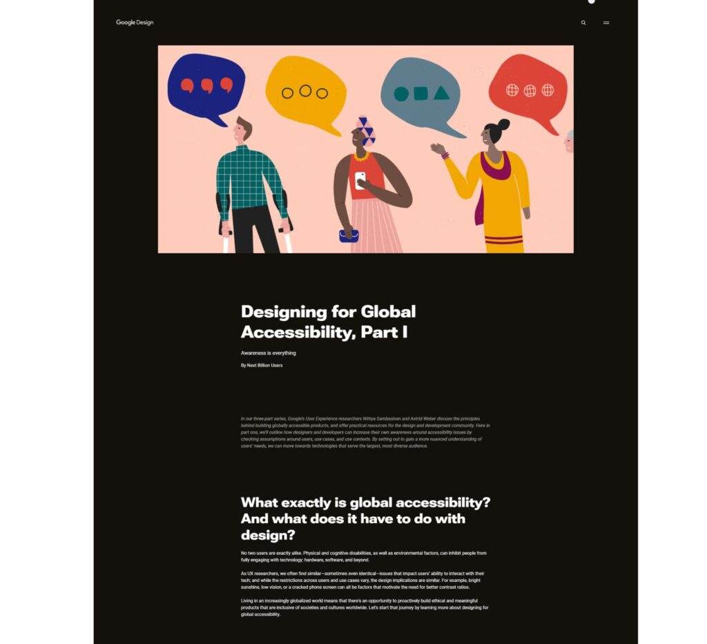
Don’t reduce the spacings that low just to create a grouping perception that users may need to struggle to process the appropriate information. On the other hand, don’t increase the spacings to that high that it would start creating a false ending experience. For example this blog page of design.google. Everytime you make a scroll, it gives you a feeling that now this is the end of the page, because of the large spacings between the groups. It will make you perceive as there is no content left after this and the chances are – you may leave the page somewhere in the middle. This is false ending.
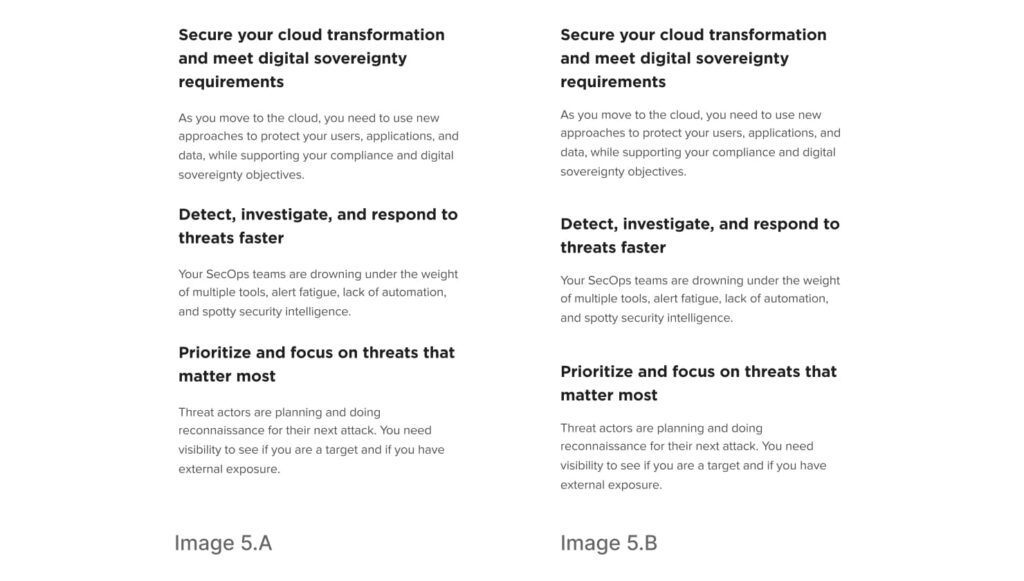
This proximity principle matters a lot when you have a text-heavy plain content page where you don’t have any other visual clue to support the groupings. In that case, you only have to rely on the spacings. I am pretty sure that you must have observed such spacing arrangement in your day to day life as in the image 5.A. If these are three different groups, wouldn’t that be a good idea to visually separate them from each other like in the image 5.B?
Like the similarity, this proximity principle can be applied across the site in multiple contexts -like the proximity within the title, the description and the CTA, proximity within the two subsections or a complete module and what not. You only need to look for the consistency that would produce a rhythm everywhere. Refer to the below spacers as an example.

Conclusion
Proximity principle helps us achieve the well balanced and visually pleasing layouts while also delivering the meaningful groupings. A smart inclusion of proximity and similarity principles together can help you create more approachable interfaces.
Until now, we learnt how to create effective visual perceptions using the shape, color, and space attributes but our next principle is even more powerful than all these -It is the principle of common region. See you in the next article!