Gestalt theory is a human tendency to perceive the shapes in a simplified and unified form, rather than seeing them as multiple, disconnected objects. It is one of the best usable design practices to reduce the cognitive loads and make the interfaces easy-to-scan & easy to perceive for the users. In this article we’ll try to explore the principle of similarity from the Gestalt theory.
Similarity
According to the Gestalt principle of similarity, the objects with similar visual properties are perceived as related to each other or belong to the same group.
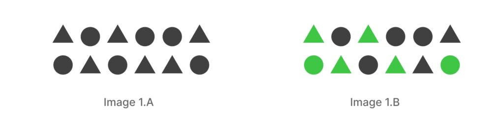
In the belowexample, denoted as 1.A, your brain will effortlessly recognize two distinct categories: one consisting of circles and the other comprising triangles. This categorization occurs because shape is the most salient and identical property. However, when we introduce an additional color to some of these shapes, your perception will shift towards segregating them based on their colors rather than their shapes (image 1.B). That is because the color attribute overpowers the shape attribute.
In UX, this similarity principle can be used in multiple contexts across the product. For example text-stylings can be similar, sub-sections can be similar, modules can be similar, even the complete pages altogether can be similar that we call them templates. And everything that shares the similar visual property, are considered having the equal priority and equal weightage in the hierarchy. That’s why this principle also plays an important role in defining the components and creating the design systems as well.
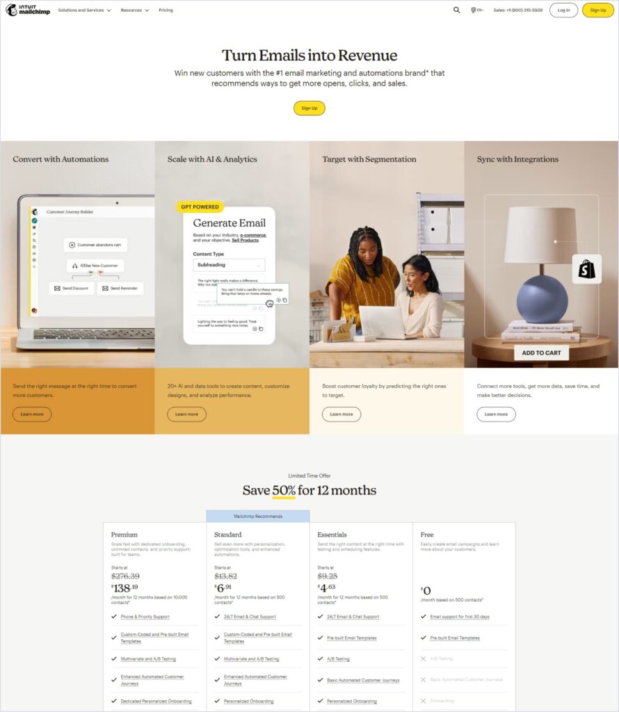
As a live example, check this module on the mailchimp home page. All the four subsections carry a similar structure and format. Title + image + description + secondary button. Again in this pricing module, they have maintained a uniform structure for all four plans. That’s the reason you don’t find any difficulty in recognizing the hierarchy and making the comparison. They have maintained similar attributes for the primary, secondary and tertiary CTA categories. All in all, they are trying to build the similarity and consistency everywhere.
Next, in this Google Workshops website- they have used this same structure for all their workshop pages. An example of how a complete page can also follow the similarity principle.

Now, we grasp the concept of how similarity can create a cohesive experience throughout the website. However, in order to uphold this similarity while accommodating diversity among various elements, isn’t it essential to introduce a degree of ‘variety’ somewhere in the design?
And there we come to the other side of the coin which is also important for us to be aware of and use effectively:
The objects with different visual properties than the rest of the elements are considered as not part of that group or a part of a separate group.
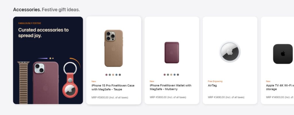
This can be used to grab some special attention to any of the important sections or elements, or to break the monotony of the patterns and make the layouts more engaging for the users, or just to separate that item from the rest of the items in the group. Checkout the module from Apple store, the first card gains an extra weightage in the hierarchy than the rest with their different identity, although it belongs to the same group.
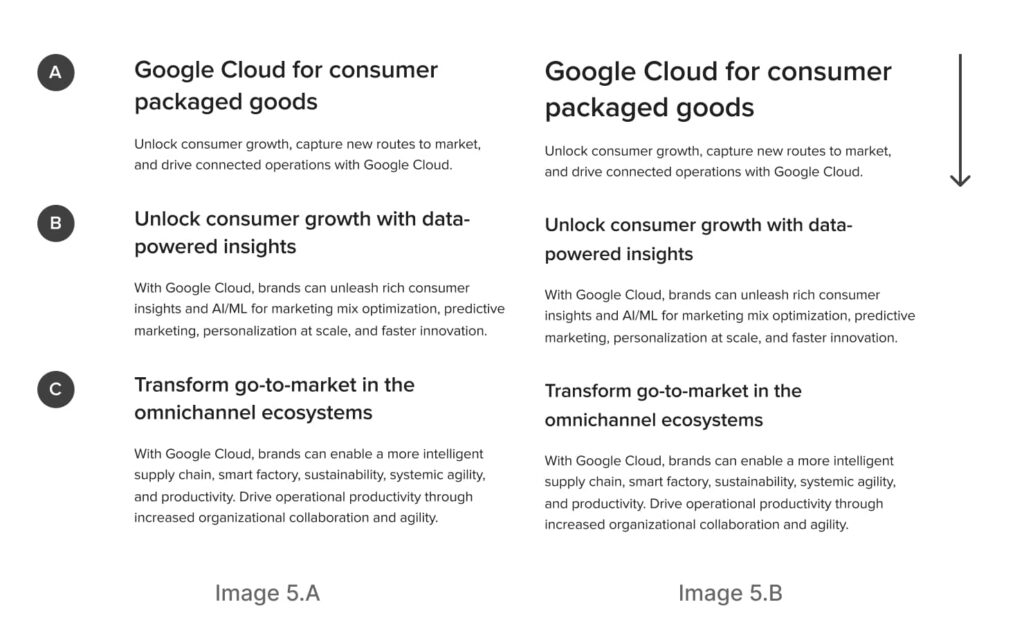
In the visual representation provided in the image 5.A below, it’s possible to misconstrue all three sections as being of equal importance due to their closely matching visual characteristics. In reality, section A holds the primary significance, while sections B and C are secondary. The slight variations in title sizes are insufficient to effectively differentiate them, leading to increased cognitive load for users.
In contrast, in the image 5.B, the content hierarchy is readily and intuitively discernible. This illustrates how to strike the right balance between uniformity and diversity in the designs.
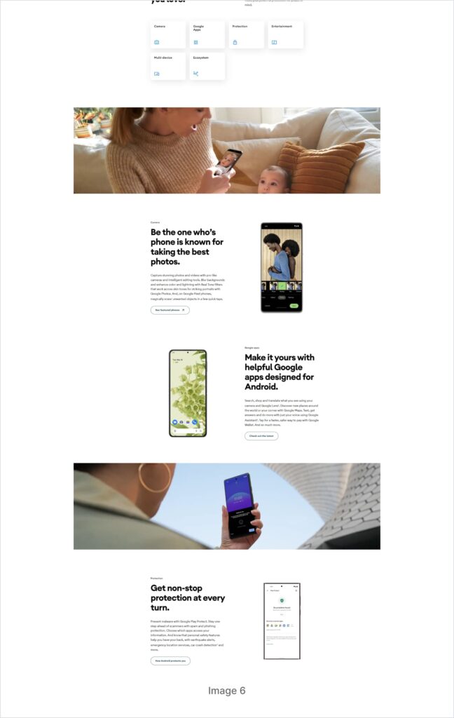
See how Android has used an end to end imagery within one similar pattern, just to give the page a visual break between the monotony of the similar components.
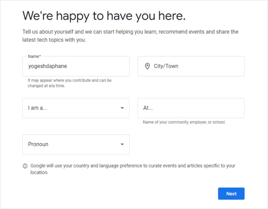
Is the blue CTA grabbing your attention quickly with having a different identity in below Google developer form?
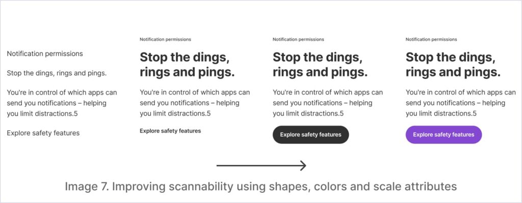
Observe the gradual enhancements of the content scannability demonstrated in the image 7 below, by utilizing the shapes, colors and scale attributes together effectively. Have you noticed how I am introducing the diversity into the similarity, thereby setting up the visual directions and establishing the visual cues to guide your perception towards my designs. You can also add accessibility standards, meaningful imagery etc but that is another layer of usability, what we are trying to comprehend now is the fundamental principles of the layout designs.
Conclusion
So now you know how to create the visual perception of the objects that belong to / or do not belong to any specific category or group by using the similarity principle. It’s up to you to define the intensity of the attention by smartly using the colors, shapes and sizes together.
There is one more element that is super helpful in creating the visual perception – spacing. There we come to our second Gestalt principle – Proximity. Let’s try to explore Proximity in our next article.


