You may want your website to be full of content for your customers to win their trust, you may want each and every feature to be described in an elaborate way, you may want every page to be full of reading material to keep your users engaged for a while. But wait- these could be reasons you may lose 84% of your audience!
Yes, you have read it correctly!
According to the research by Steve Crug in his popular book ‘Don’t make me think‘- There are only 16% users who read the content on the website word-by-word. And what about the remaining 84%? They will just scan your page quickly and only if they find any piece of information aligned with their interest, will go for reading it.
People don’t read, they scan!
As we all know, the internet is the most crowded place. If you search one keyword, you’ll get minimum 1000 results that one human life is too short to crawl through every one of them Users don’t have that much time to read the content & then know if this is the right one they are looking for. They just want to skim it quickly and move on to the next!
So as per the calculation, you just have 4 to 6 seconds to win your users attention, convince them and to make them hang on your website further.
One more reason they don’t read is – reading on the screen is not as easy as reading in the actual world. The backlit coming from the screen is very stressful for the eyes. That’s the reason most probably, they will just scan your page quickly first and ONLY if they found any piece of information aligned with their interest, will go for reading it.
This is where the scannability comes into play!
What is scannability?
“Scannability is presenting the layout in such a way that users can find the relevant piece of information quickly and easily.”
Scannability is one of the most important aspects in the world of user experience. It helps in conversions to a measurable distinct. Making your website scannable…
- Allows users to find the relevant information easily, which encourages users to be involved with the content
- Improves the SEO and reduces the bounce rates
- Helps users understand the website structure and complete the task quickly
To ensure your website is well scannable, you can just ask two questions to yourself after completing the design.
“What are our target users expecting from our site?”
“What are the key information areas on the page users would see in the first few seconds?”
Well, this is all about why and what about scannability, but how can you bring it to your designs?
How can I make the layout scannable?
As we all know that users have visited our site to get their tasks done or to learn/to get advice on something, right? Our job is to make their job easier. Below are the couple of things you can follow into your layouts.
Maintain a proper visual hierarchy
Visual hierarchy is an arrangement of the elements on the page as per their priorities. For example, you can see the paragraphs under the titles, subsections under the primary sections etc. The variety of font size would help you to understand which comes under what easily.
Visual hierarchy gives you the control to decide and direct the path of your user’s attention.
There are many ways to create a visual hierarchy in your pages. Although the bottom line is to make the content optically scannable, you can consider some design factors below to achieve the same.
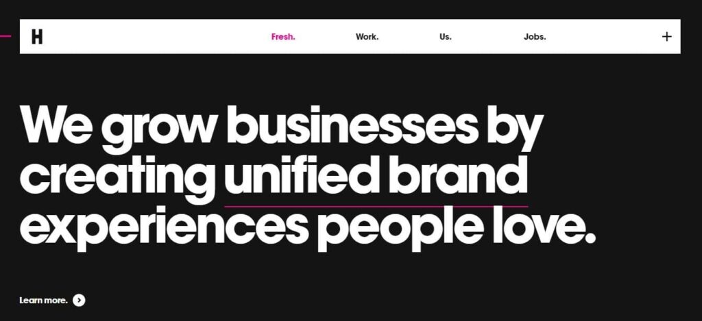
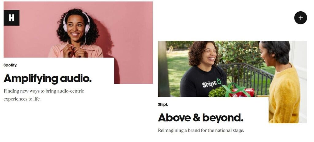
Size: Large size elements are often perceived as something important. See the home page of hugeinc.com and Cafe Mokarico.

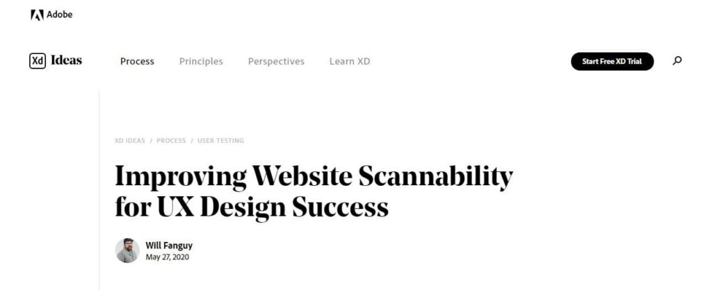
Contrast: Contrast is the another best way to prioritize the content. See how xd.adobe.com have effectively made use of contrast variations in their header and navigation.
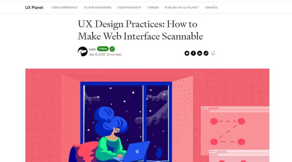
Color: Did this colorful image on a plain white background in the UX planet’s blogpost immediately grab your attention?
Typography
Imagine this article with no imagery. Lengthy paragraphs with single font styling followed from the beginning to end like regular or bold. How long would you go while reading? I am sure you’ll definitely quit reading after one or two paragraphs max.
Now just go back to the top again and check what made you read it till here without losing your interest, without putting much stress on your eyes and brain? What made your reading simpler?
Here are a few tricks:
- Try using larger font sizes
- Use variations in the font sizes, styles and colors
- Content broken down into smaller paragraphs. Bullet lists, highlighted text wherever possible
- Affordances for hyperlinks
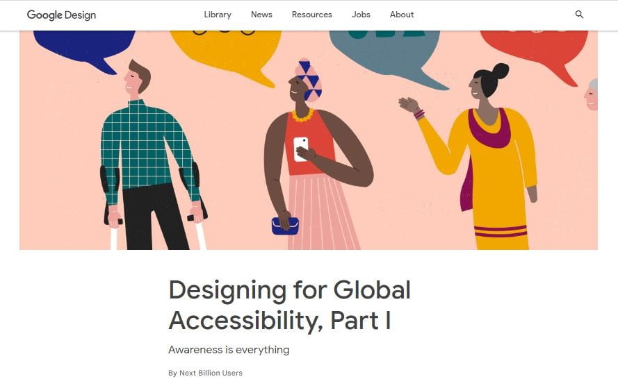
This is Google’s blog on Global accessibility. Although there is a lot of text on this page, see how they have presented it in a very easily scannable manner. What have they done differently?
Use of imagery & videos
Images speak a thousand words. Attractive imagery immediately catches your attention, reduces the cognitive load and makes users hang on for a while. The imagery used on hugeinc tells their own story themselves in a while.
Whitespace
Whitespace is not literally a ‘white’ space but a blank space or breathing space. This is also a very important design element to let users focus on a particular object. If I put a small black dot on a plain white background, you’ll see that dot first although there is a lot of empty space around, right?
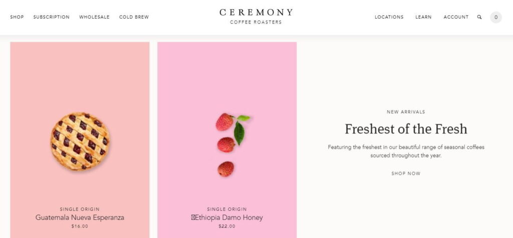
See how effectively Ceremony coffee has made use of white spaces. Did your eyes stay at the product photos first? Then product name, and then module title ‘Freshest of the Fresh’?
While taking care of the negative space around the pages, one also needs to ensure to put an appropriate spacings between two subsections (eg. two paragraphs) OR two sections (subheadings) OR two different modules altogether. (Gestalt’s law of proximity) This will help users to distinguish between the content easily.
Some other things you may consider
Below are some additional recommendations apart from the above techniques to increase the scannability in your pages. Most of them are separate subjects altogether to be researched and discussed upon, I feel worth just mentioning them here:
Effective content writing: Although content writing is not a designer’s responsibility, we can give some directions to the content writing team referring to our layouts ie. word count limits, some key highlights etc. An effective content writing may include:
- Crisp and concise content.
- One idea for one paragraph
- Content broken down into smaller paragraphs, bullet points, numbered lists, timelines / steppers etc.
Study and apply common user scanning patterns
Gestalt Laws: By studying Gestalt laws, you can get better insights on how the human eye perceives visual elements.
———————————
In the fast growing world of competition, it is always worth providing users a better user experience by keeping the content on your page easy to find. I hope these scannability techniques will help you in achieving your goals to some extent




1 Comment
Comments are closed.